Discover Home Loans Application Product
This case study, including all recreated designs, written content, and supporting code, is presented solely for portfolio and employment-seeking purposes. It's a custom depiction of the Home Loans Application software. Its purpose is to demonstrate my ability to solve complex enterprise-level user experience problems, communicate design decisions, and contribute to secure, customer-facing financial products. It is not intended for commercial use, redistribution, or representation as an official Discover Financial Services or Capital One product. None of the content or designs presented were extracted, sent, or migrated from Discover Financial Services or Capital One.
An enterprise redesign of Discover's Home Loans application — reorganizing an overbuilt design file, unifying components with the Discover Design System, and rebuilding the document submission experience that was slowing applicants down by months.
Principal Product Designer
Product Manager
Sr. Manager, Creative & CX
Sr. Manager, UX Design Enterprise System
Problem
This project was originally set out to be a redesign, so the product and marketing teams knew from the start there were design flaws, UX inconsistencies, and design-hierarchy problems baked into the existing Home Loans application. My role as Principal Product Designer was to bring order to an overbuilt file, unify it with the emerging Discover Design System, and ship measurable experience improvements.
Project Problems
- Too much content and too many pages (an overbuilt design), so no team member could navigate the Figma file in a way that made sense for their role.
- Incomplete navigation logic from page to page, including high-level menu items.
- Components were not unified against the new Discover Design System Library — though we had flexibility to contribute to it while keeping our own unique components, since the application was a unique product.
- Design sections (application parts, registration, funding, etc.) were split across several product managers with no universal organization system.
- Documentation was overbuilt and not one-size-fits-all for every internal employee referencing the designs.
- No prototype existed to demo the development environment to leadership or help customer service agents troubleshoot.
- Incomplete variations of error pages.
- No breadcrumbs for page logic and menu logic.
- Document submission per loan took too long — an average maximum of 2–3 months.
- Homepage task structure was inconsistent based on priority and length of each task.
Work Done
- Login and registration flow with proper 2FA and agreement to terms and conditions.
- Newly designed navigation logic and a simplified navbar and nav menu — removing unused items and using a mobile-first approach.
- Created logical, simplified components scoped to the project but also submitted into the Design System Library — for example, a pill tab component that proved most effective for the many pages that were formerly split apart.
- Built a high-level organizational design structure unifying the start-to-finish product along the loan applicant's pathway, so every internal department could read it: large orange labeling for enterprise-scale legibility, a legend for custom documentation sections (colored boxes for animations, design boards, conditional screen states, team review-status indicators, and legal submission status in a replicated Figma file).
- Maintained a functional design system (v1.0) specific to the Home Loan Application — the "internal website" that became the predecessor of Discover's newer enterprise system — keeping developers on the correct components current within Storybook for React Native.
- Built an interactive prototype to demo the development environment to leadership and give customer service agents a reference for troubleshooting.
- Completed the missing error-page variations for consistent handling of edge and failure states across the flow.
- Added breadcrumbs to clarify page logic and menu logic, giving users a clear sense of location and path through the application.
Official Case Study Problem Statement
While there were many UX problems I worked to solve alongside the marketing team, product manager, and developer teams, one stood as the biggest hurdle slowing the efficiency of the entire application process: Document Submission. There were 86 different document types in combination with over 20 different application specifics, which varied how many document types each applicant would face.
In Sync with the Discover Design System Library
The enterprise-level design system was created, maintained, and led by Ravi Jain. Coming into this project, leadership provided me with specific leniency to keep the Home Loans App within its own version of the prelaunch design system. The generic buttons, fonts, grid, icons, UI structure, and top-level page components were all uniform with the current design system.
Specific tab components, summary cards, graphical charts, graphical table presentations, and customized process-based buttons were all created and maintained by me separately for the Home Loans App — built to be submitted and reviewed by the design system team for approval.
Design System Prototype
Understanding the Bottleneck
Having access to the document CMS from the agents showed which documents averaged an efficient timeframe to complete. Certain documents were not only harder to find but harder to complete — some submissions required multiple documents for a single validation step that agents had to clear.
In the old design, document submissions were stacked based on name and surfaced as soon as they became available — it could be 2 at once or 8 at once. For the new design, we wanted to present what was easiest and most basic first, then what took the longest. This also revealed how long submissions took to complete and which tasks were specific to each document requirement.
The new design became modular: the user could see all documents at once, connect with agents directly, and know whether a document was processing or complete. The old design required them to be pinned to the module, edit, and resubmit — making the user feel stuck. If the changes were simple and submitted once, users could then connect directly with agents via the "Messages" page.
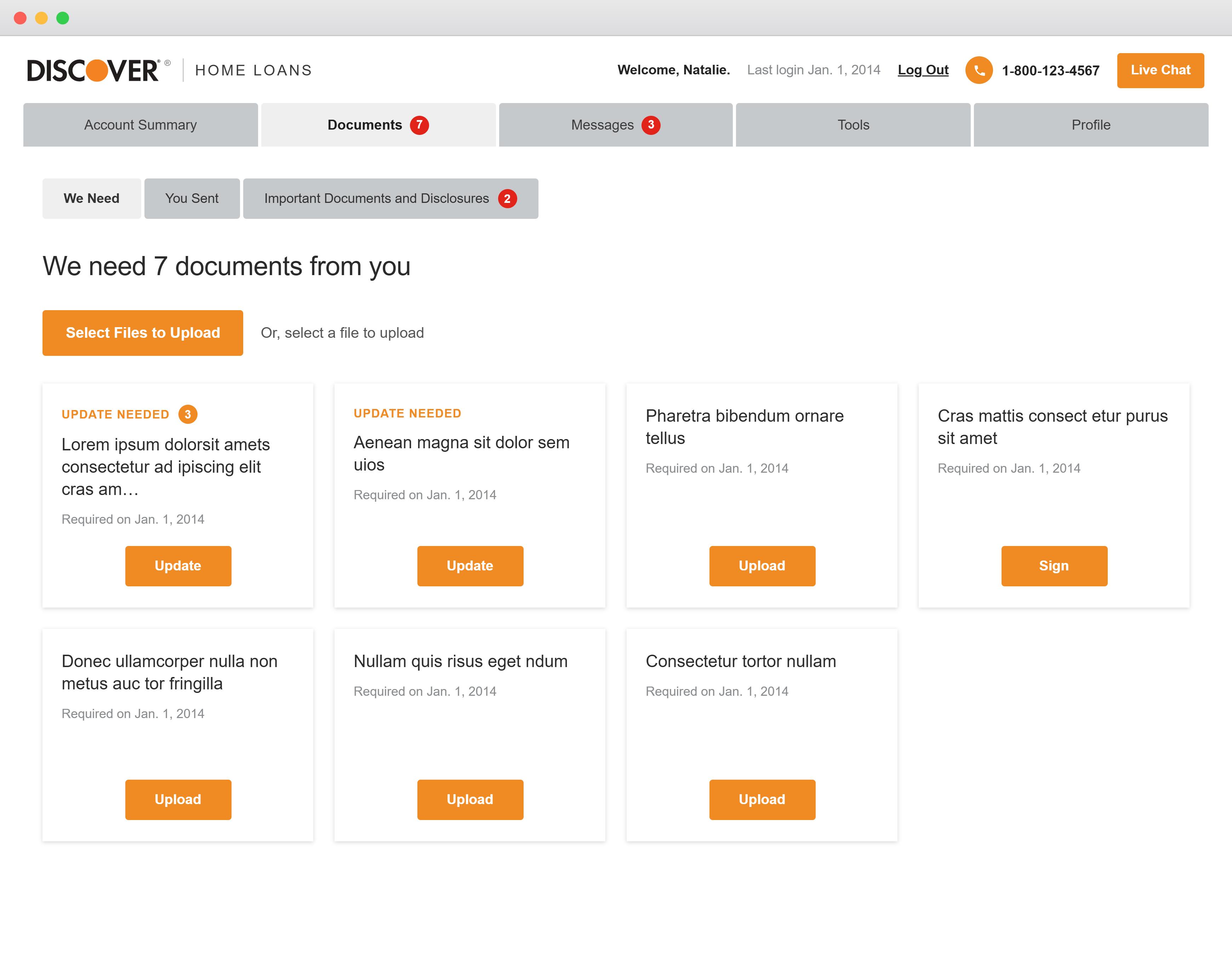
Issues From the Old Design
- Accordion-style to-dos that appeared in random order and at any time depending on applicant type.
- Certain to-dos were not part of the document submission model at all.
- The user didn't know which one to do, how long it took, what the document looked like, or what its progress was.
- No consistent messaging except phone support with the Discover customer service team.
- No visual UI tracking system.
- No integrated chat to piggyback edits.
- Not enough sample documents — and the ones provided were outdated.
- Agents focused more on phone calls than online messaging, which sometimes introduced delays.
Reimagining Document Submission
The redesign replaced a stack of unpredictable accordions with a single modular surface — ordered by effort, tracked across three stages, and connected directly to agents. The flow below contrasts the old pinned-accordion experience with the new modular model.
Before & after: the document submission journey, from pinned accordions to a modular, agent-connected model.
Mapping the Document-Submission Experience
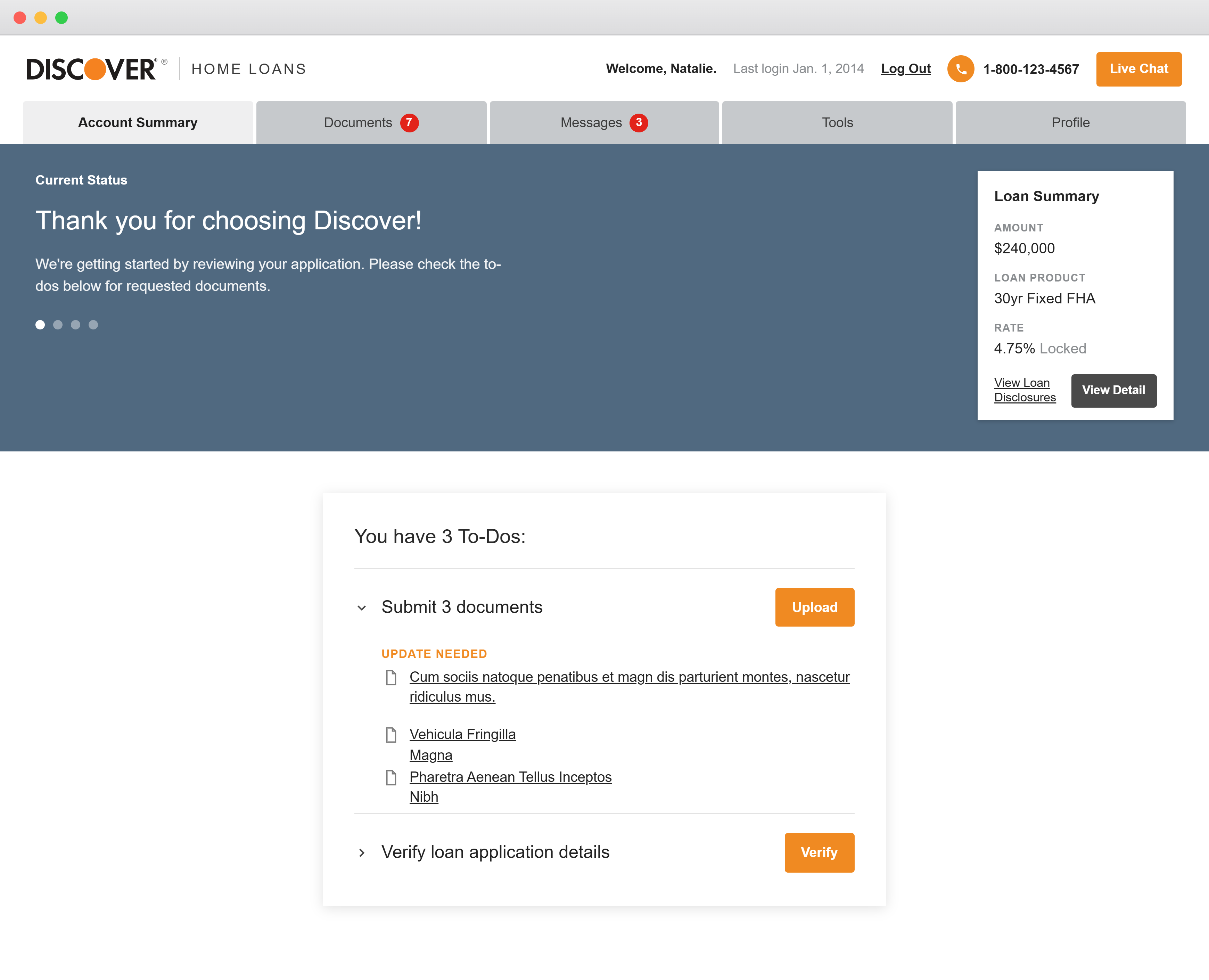
In the original product, document submission lived in two places at once. From the Account Summary, a "To-Dos" card let the applicant upload a document directly. The very same documents also appeared on a separate Documents tab as individual cards — each with its own Upload, Update, or Sign action. Having two entry points for one task was a constant source of confusion. Whichever path was used wrote a record to the Documents tab, but the two locations didn't always stay in sync — a document could read complete in one place and unfinished in another. When an agent needed a correction, the request came back to that same card, roughly 80% of the time by phone and 20% through messages, forcing applicants to bounce between modules with no live tracking. The result was exhaustion — and an average of 2–3 months to finish.
Old flow: two duplicate upload paths feed an out-of-sync record; corrections loop back through phone (80%) and messages (20%) with no live tracking.
The redesign collapses both entry points into a single, fully functional Upload Module that updates in real time. The individual upload cards are gone; every document is grouped by clear status — Pending or Submitted — and all edits route through the Secure Message Center, where agents adjust submissions directly instead of calling. Beneath the requested documents, a new Upcoming Documents section shows applicants what's coming next, so they can gather and prepare ahead. One source of truth, one communication channel, and live status replaced the back-and-forth.
New flow: one upload module, status-grouped documents, an Upcoming Documents section, and a single secure-message channel — all with live tracking.
Redesign to modern
Below is the old version of the application — the starting point that shaped the redesign. These screens illustrate the stacked accordions, fragmented messaging, and inconsistent task hierarchy the new modular system was built to replace.
Old Version"We need 7 documents" — the original document request screen with stacked, unordered to-dos.
Account Summary — tasks pinned to the summary page with inconsistent priority.
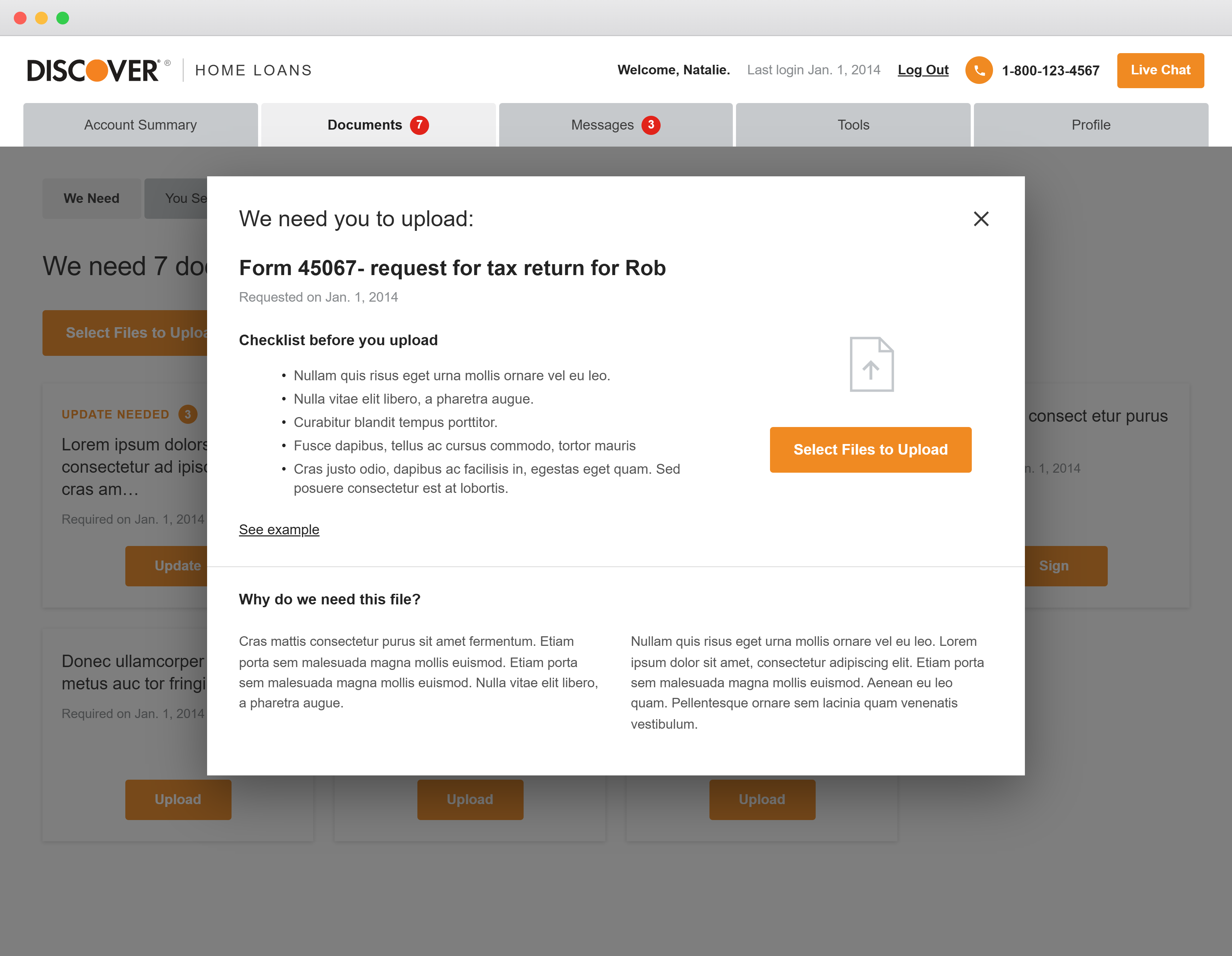
Upload modal — the edit-and-resubmit interaction that left users feeling stuck.
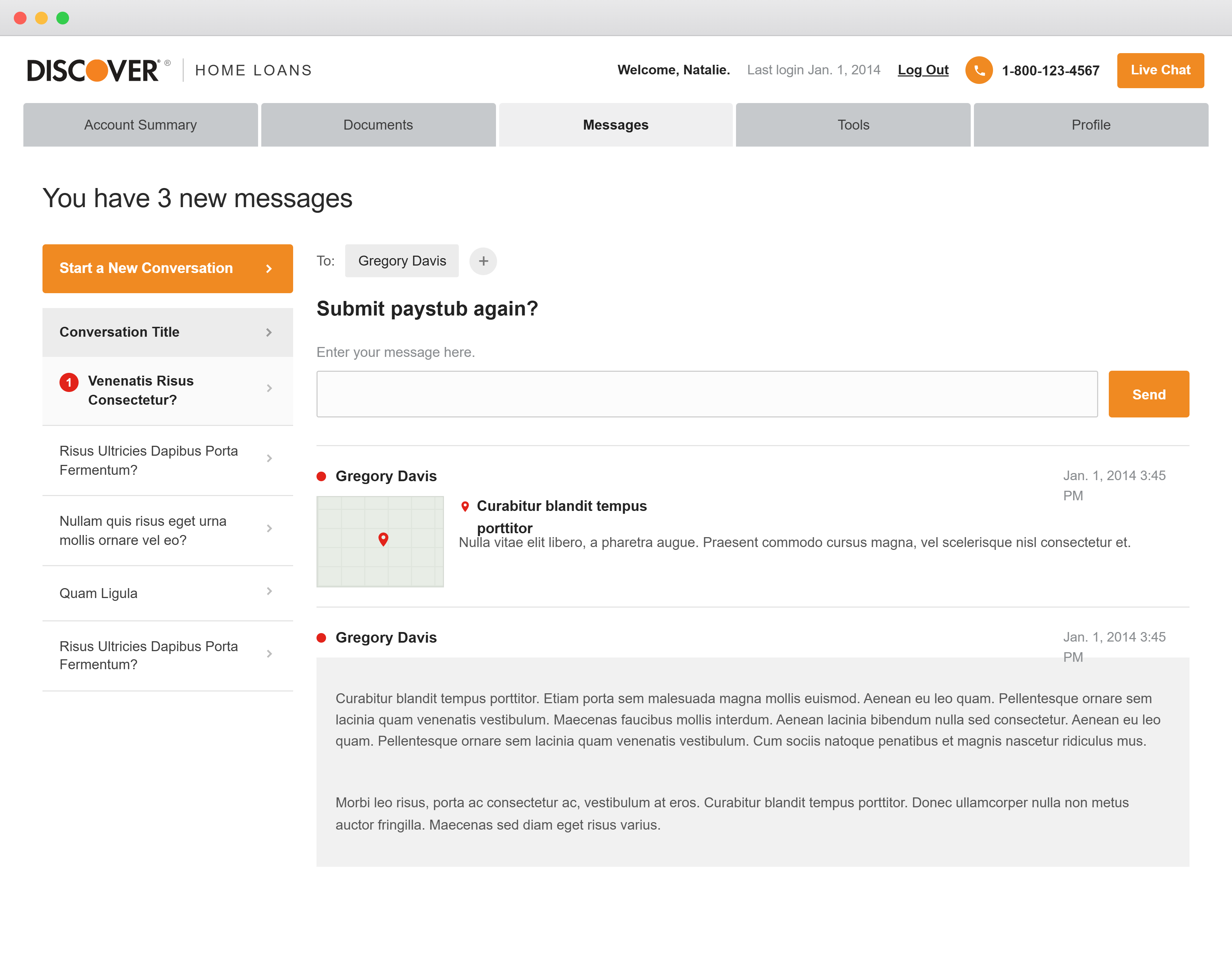
Messages — the predecessor to the secure message center, before agent-direct edits.
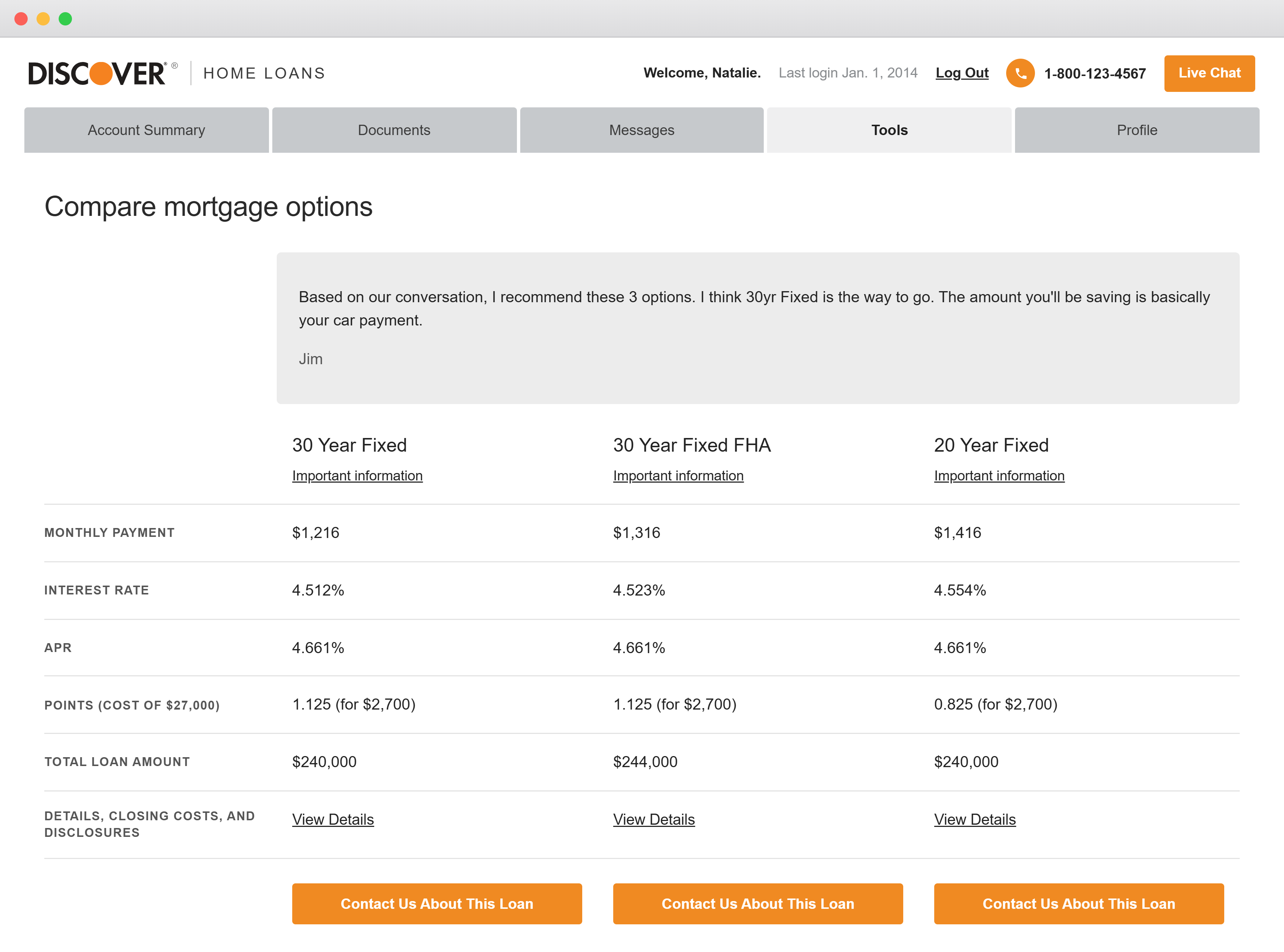
Compare mortgage options — dense comparison UI prior to component unification.
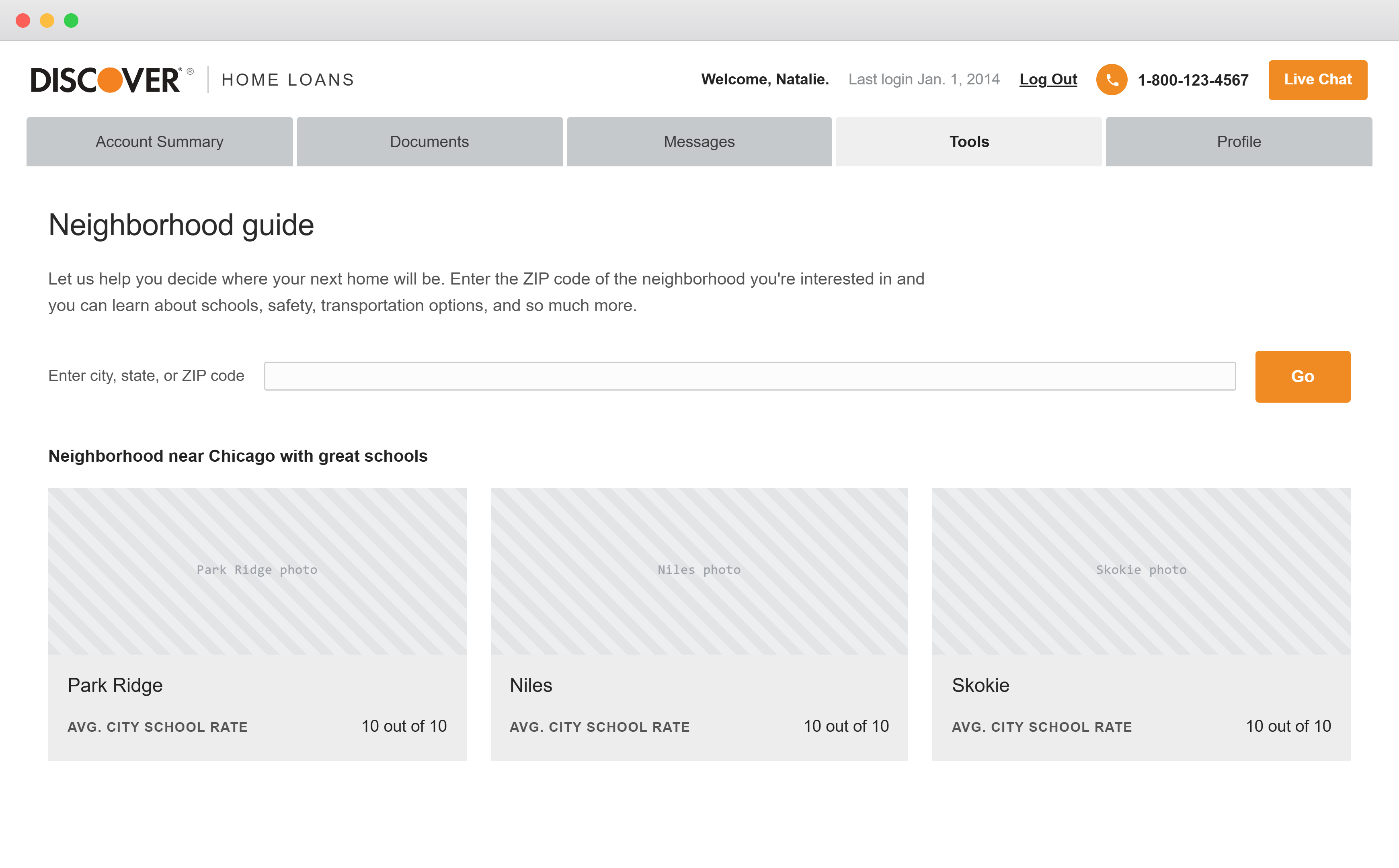
Neighborhood guide — a supporting view carried into the redesign's component audit.
From Stacked Accordions to a Modular System
The new design replaced the pinned accordion model with a single modular surface where every required document is visible at once — ordered by effort, surfaced gradually as the application progresses, and clearly marked across three stages: To Do, Processing, and Complete. The pill tab component unified pages that were formerly split apart, and a simplified, mobile-first navigation gave every internal department a consistent way to move through the applicant's pathway.
New Version.png)
.png)
.png)
.png)
.png)
.png)
.png)
.png)
.png)
.png)
.png)
Complete Prototype
The full, fully functional Home Loans application prototype — navigate the menu, open the Summary, Documents, Messages, Profile, task flows, and the Design System, all live.
The Omni-Channel Origination Journey
Discover Home Loans (DHL) offers an omni-channel origination experience, allowing seamless switching between digital self-service and an agent-guided experience. The loan origination process usually takes 30–40 days, reflecting regulatory complexity and required underwriting rigor. Mapping each stage's average duration exposed exactly where applicants stall — and where document collection and processing dominate the timeline.
Net App-to-Fund conversion sits at just 14.4%, with 34% of applications auto-declined before Pre-UW. The early funnel — Apply through document collection — is where the majority of applicants are lost, which is precisely why document submission became the focal point of the redesign.
Origination Journey — Before vs. After
Self-Service Screen Flow
Digital self-service tools are available throughout the loan journey with mobile-first designs and high adoption. Each origination stage maps to a dedicated mobile screen — sequenced below from pre-qualification to closing.
- Select a loan option; DHL provides an official Loan Estimate and confirms eligibility, income, and debts.
- Loan Amount $67,800 · Costs at Closing $0
- 30-yr — $1,620/mo · 10.49% Fixed APR (Lowest Monthly Payment)
- Links show what documents are required and where they are in the process.
- Status states: Required · Pending · Accepted
- Email Me This List · More Ways to Submit
- e.g. Signed Intent to Proceed; 2022–2023 W-2 forms
- Additional details requested to keep the loan moving forward.
- YTD earnings are lower than last year — pick the best explanation.
- Options: incentive pay changed · changed job · took a leave · Other
- Account 1 of 6 — verify account number & payment address for each payoff account.
- List of payoff accounts (e.g. US Bank — balance, opened date).
- "This creditor looks familiar" confirmation.
- Application has been sent for underwriting review.
- Confirm Payoff Details — verify accounts paid off with loan proceeds.
- Update Insurance — add Discover Bank to the mortgagee clause.
- Pick a date and time for your closing.
- Calendar — June 2025.
- Time (CDT): 9:00 · 9:33 · 10:00 AM.
Self-Service Screens — Before vs. After
Two Entry Points
Applicants enter through one of two digital front doors — and almost all of them touch both. The Online Application starts the journey; the Secure Website carries it through to-dos, documents, and messages.
"Let's get started — no need for documents yet; it takes a few minutes."
- Loan info: amount $170,000, purpose "Improve my home"
- Home info: 202 Fancy Avenue, city, optional unit
- 89% of all DHL applications originate here
"Hello, Alex — you have 6 To-Do items."
- Enter Alex's income · Submit 4 documents · Reply to 1 message
- Uploads: PDF, JPG, GIF, or bitmap files
- Loan status: "Getting the basics"
Key Learnings
On an enterprise project, the file is a product. Before any screen could improve, the team needed a shared, role-aware way to read the design — large orange labeling, a documentation legend, and conditional screen states did as much for velocity as any UI change. Organization was a deliverable, not overhead.
The biggest experience wins came from removing pressure, not adding features. Making documents predictable, ordered, and trackable — and connecting users directly to agents — reduced the anxiety that was quietly costing days of progress. Designing for the agent and the applicant at the same time is what turned a 2–3 month bottleneck into a process people could actually finish.
Outcomes & Reflection
Document Submission Improvements
- Modular one-size design showing all documents, revealed gradually over completion.
- Upcoming documents surfaced so users could prepare and be more efficient.
- Single submissions where agents could make edits themselves or help via phone call or secure message center.
- Progress tracking for all three stages.
- No longer pinned to the summary page with stacked accordions — one per document, or several documents per accordion.
- 50% faster completion time.
- Users reported feeling less confused or overwhelmed, which decreased breaks and daily drop-off that could delay single steps for several days.
- Due dates became less relevant and less pressuring.
- The secure message center delivered quicker response times, with multiple agents able to service one customer.
By rebuilding the document submission experience and unifying the design system, the redesign delivered measurable gains for applicants and agents alike:
Modular One-Size Document View
All documents visible at once, ordered by effort and tracked across three clear stages — replacing unpredictable stacked accordions.
Agent-Connected Secure Messaging
A secure message center let multiple agents service one customer with faster replies, and edit submissions directly instead of relying on phone delays.
Unified, Reviewable Design System
Custom tab, summary-card, and chart components were maintained in sync with the enterprise library and kept current in Storybook for React Native.
The redesign cut document completion time in half. Users reported feeling less confused and overwhelmed, which decreased breaks and daily drop-off that could otherwise delay a single step for several days. Due dates became less relevant and less pressuring, and the secure message center delivered quicker responses with multiple agents able to service one customer.
Beyond the applicant experience, the project established a readable, role-aware organizational structure across an enterprise-scale Figma file — and contributed reviewed, reusable components back into the Discover Design System.