
FytForge
A minimalist web-first workout tracker designed for the 75% of adults who never open a fitness app. No install, no daily notifications, no dashboards that guilt-trip you for missing a day — just a clean scheduling surface, a 300-exercise library, and one email digest every Sunday. Built to respect screen time instead of compete for it.
fytforge.comProduct Designer & Front-end Developer
CEO/Owner, Visionary for FytForge
Problem
Modern fitness tech runs on high energy that not everyone has. It sells pressure as motivation, comparison as progress, and constant measurement as care. It nudges every skipped day, ranks every lift against a leaderboard, scores every calorie, and hands out streak badges for obsession. The numbers back up the mismatch: three out of four US adults don't track their fitness at all, and about 80% of those who try bail inside 30 days. The problem aims to find the user between no-tech and technology. The inbetween space where the moment of conversion to fitness consistency lives.
Solution
FytForge starts from the inverse. The team set out to build for exercisers who know how to show up, put in the work, and walk away done — without an app grading them for it. Guidance without noise. Structure without judgment. Progress without obsession.
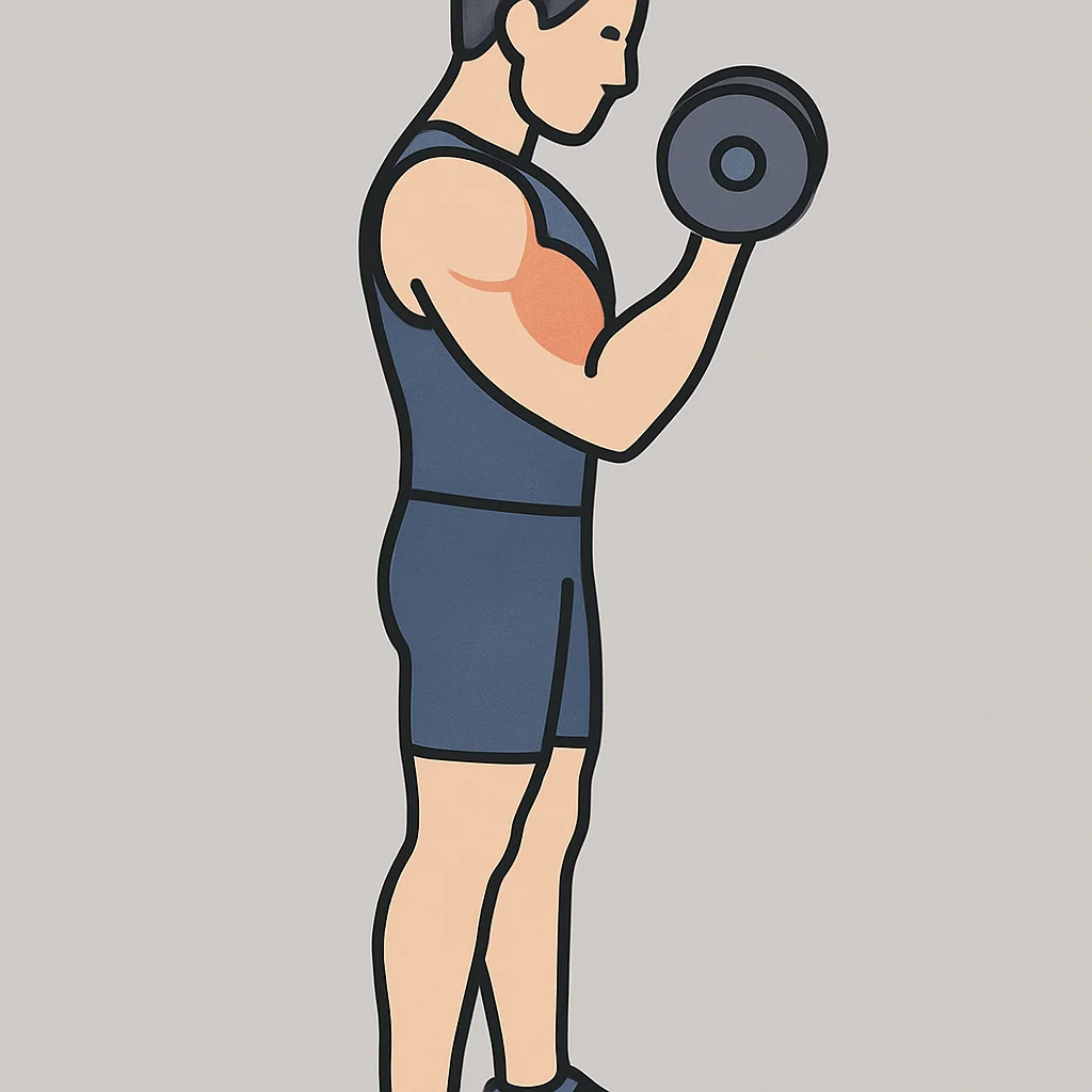
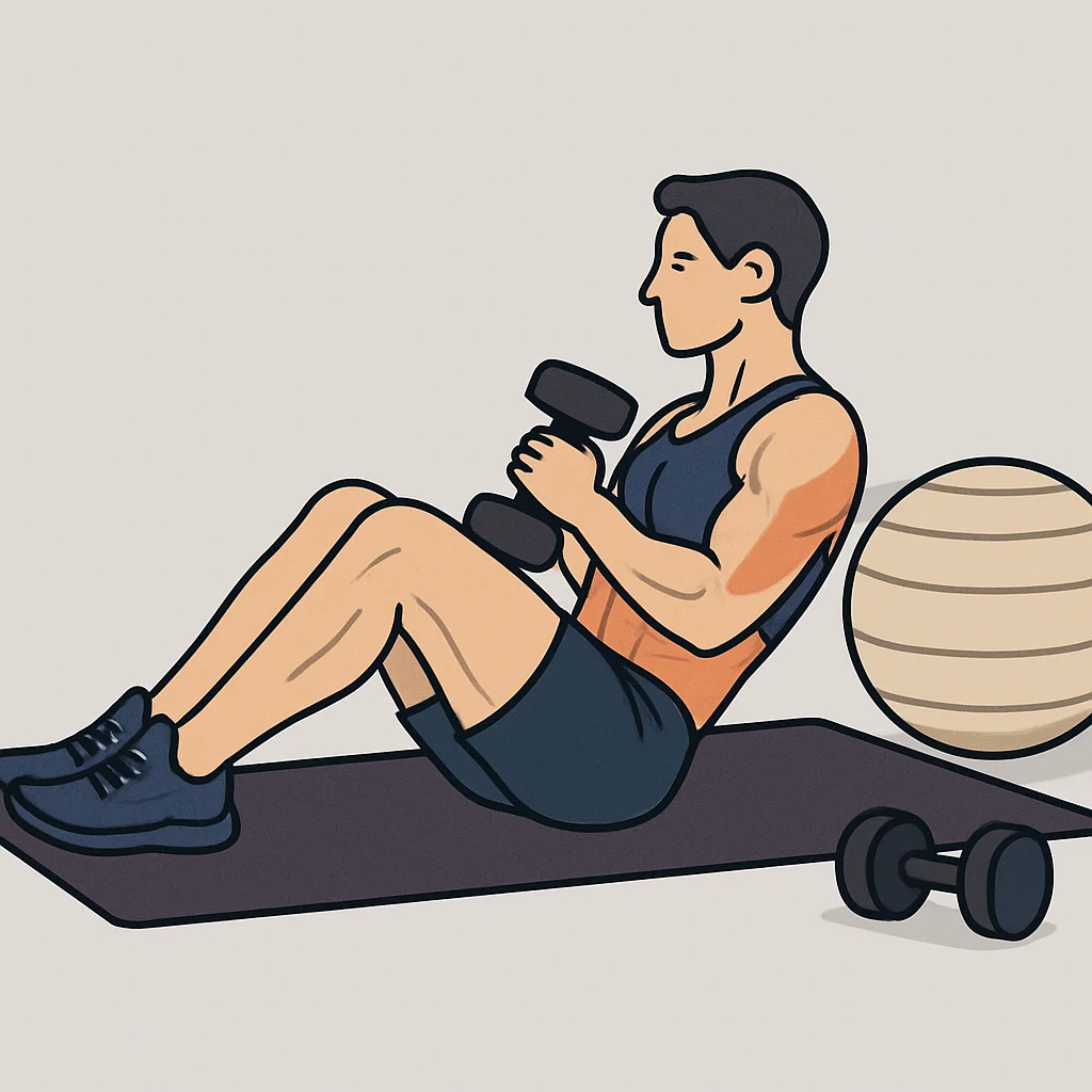
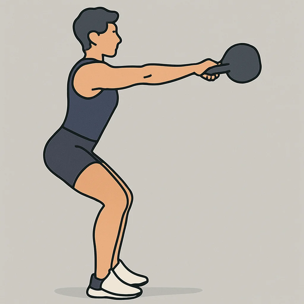
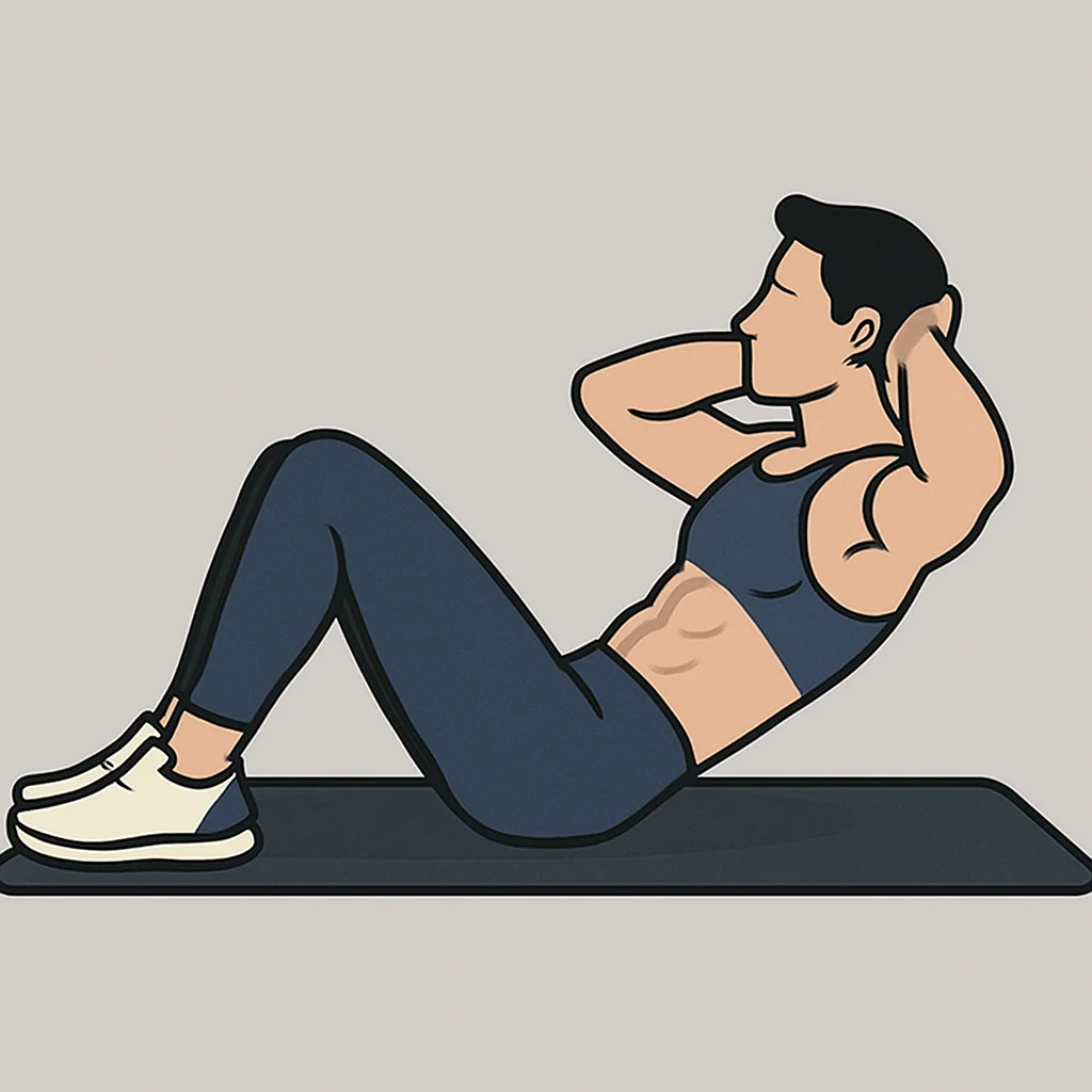
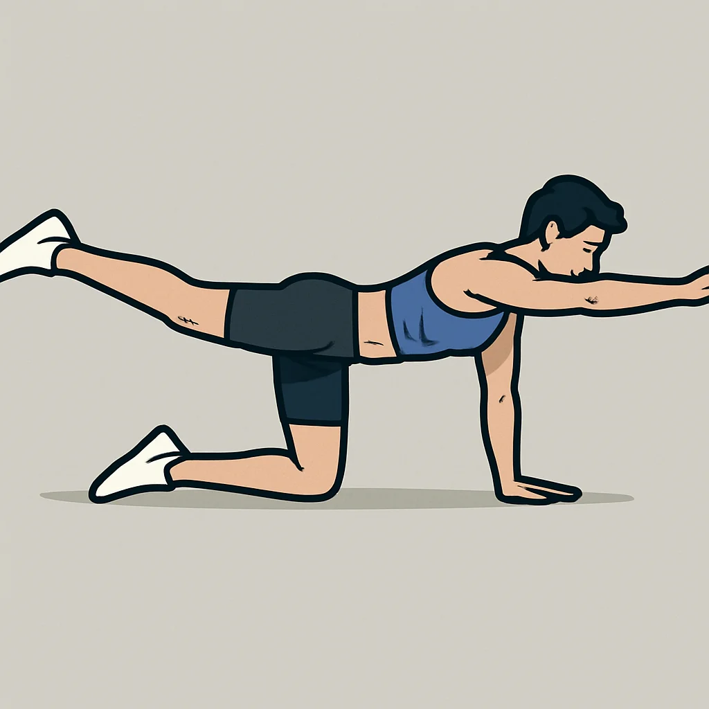
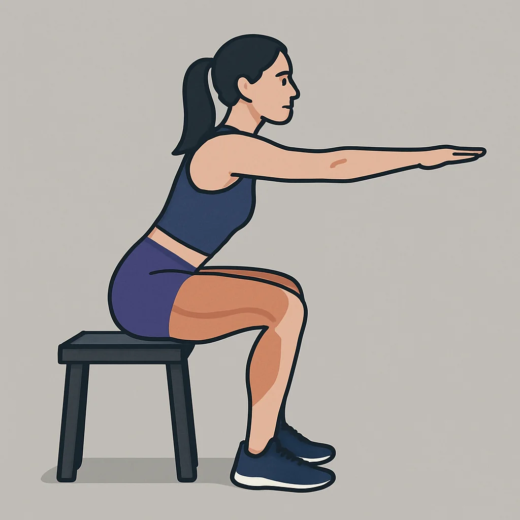
It's designed to require no mobile app install, no daily push, and one email a week summarizing what you did. Schedule workouts on a calendar, pull from a curated 300-exercise library, and walk away.
The Case for Doing Less
Before FytForge shipped, the research team pulled the numbers on how people actually use fitness technology — or don't. Across independent sources the picture was remarkably consistent: mainstream fitness apps don't reach most adults, and the ones they do reach abandon them. This wasn't a marketing problem to solve. It was a product thesis to build on.
FytForge Field Survey
Alongside the secondary research, the FytForge team ran a short, 3 question survey across four undisclosed Planet Fitness locations over a six-month period to sanity-check the thesis with real gym-goers rather than panel data. Respondents were approached during and after their workouts during both weekday and weekend foot traffic, kept anonymous, and asked to answer from their own experience.
Two-question gym intercept survey
Do you feel you have too many apps and wish you could delete some?
Takeaway — roughly 8 in 10 respondents feel some version of app overload, but almost a fifth don't. Useful counterweight to the thesis: not everyone who works out wants fewer apps.
Do you like your current fitness app?
Takeaway — fewer than half of respondents actively endorse the fitness app they use. Roughly a third opt out of fitness apps entirely.
Do you feel you could work out without it?
Takeaway — 7 in 10 respondents say their workout doesn't require an app at all — including many of the same people who currently use one. A large population is pre-willing to work without an app; most aren't aware that's an option.
The field survey aligned with the secondary data without duplicating it. The national numbers describe behavior: some adults don't track fitness with apps. The intercept survey describes sentiment: most gym-goers who do use an app are ambivalent about it and believe they could train without it. FytForge was designed for the overlap — people who already know how to train and would prefer not to carry another app to do it.
What the data tells us
The mainstream fitness-app playbook is daily engagement, gamified streaks, and push-notification velocity — optimized for DAU, not for the user's actual fitness. That playbook produces a 92% 90-day churn curve. FytForge runs the inverse thesis: build for people who already know how to lift and don't need a coach in their pocket. Remove the install step, remove the daily nag, charge nothing, and measure success by whether people come back on their own instead of being dragged back by a notification.
Product Ideation
The Fitness Technology Spectrum
This gauge visually represents where the FytForge user exists — between the reality of heavy technology (mobile apps, smartwatches, and heavy gamification with notifications) and not using any of it at all. FytForge lies in the middle of that balance, in an age where users are beginning to use less technology, or simply want the option.
Four Product Principles
Every design decision gets checked against these four. If a feature fights the principles, it doesn't ship.
Hosted on Netlify, fully responsive, works from the phone browser without the App Store gate. Every friction point an install adds is one more reason a user never returns.
A Sunday email digest is the only outbound channel. No push, no streaks, no shame-nudges. Delivered via a Netlify scheduled function.
localStorage paints the UI instantly, Supabase is source of truth, hydration happens quietly in the background. Works on flaky gym Wi-Fi without a spinner.
No calories. No competitions. No leaderboards. No "friends also worked out today." Just the schedule, the exercise, and you.
Logo & Identity
The name is two ideas welded together. Fyt is a stripped-down respelling of fit — intentionally off-kilter, like the product itself: no vowels wasted, no compromises to fit the category convention. Forge does the heavy lifting. It reframes fitness as blacksmith work: something you shape through heat, repetition, and deliberate force, not something you download. Strength is forged, not tracked.
The mark had to resolve both halves in a single glyph. A literal flame was considered and rejected early — too close to CrossFit-style branding. A crossed-hammer-and-barbell felt like a blacksmith novelty shop. The concept that stuck: a dumbbell where the two weight plates double as anvils. The plates become the forging surfaces, the bar becomes the lift itself — one simple silhouette holding both meanings at once.
Final lockup — mark + wordmark
Visual Language & Experience
Dark-first UI with an indigo primary. Poppins display type for the weightlifter-brand energy, a single clear CTA per view, and aggressive whitespace to signal this isn't trying to be like the average workout app. The homepage itself is the value proposition in text form: Simple Workouts. On Your Terms.
A purpose-built design system
The website and user interface is driven by a single, purpose-built design system I authored before Fytforge was born. Tokens, atoms, molecules, organisms, charts, and full-page templates all live together in a standalone library documented at jakearciniega.com/design-system.
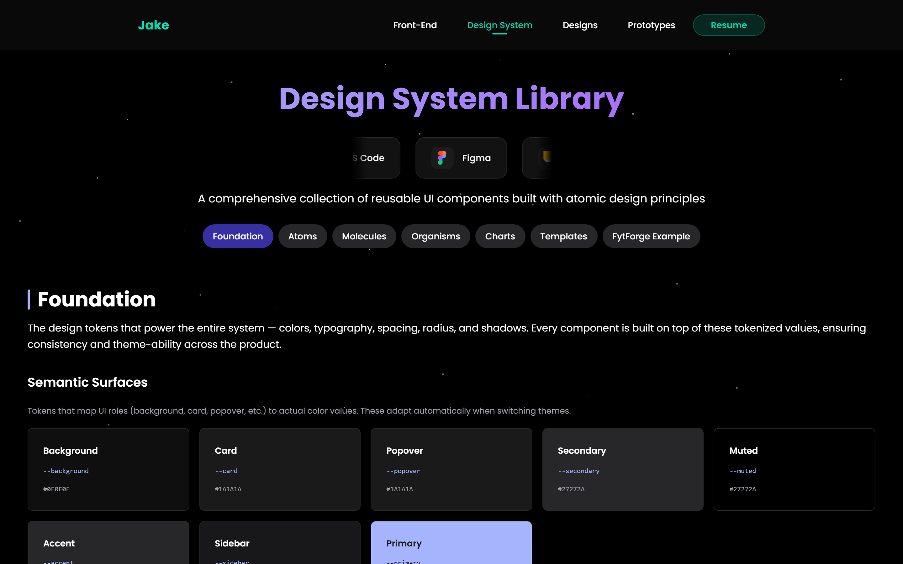
Design System Library — the canonical reference. Every color, font scale, radius, shadow, and spacing unit used in FytForge originates here and is pulled directly into the app as shared style variables.
Foundation — semantic surface tokens (background / card / muted / border), 11-step primary/success/warning/error color scales, and the full Poppins type ladder.
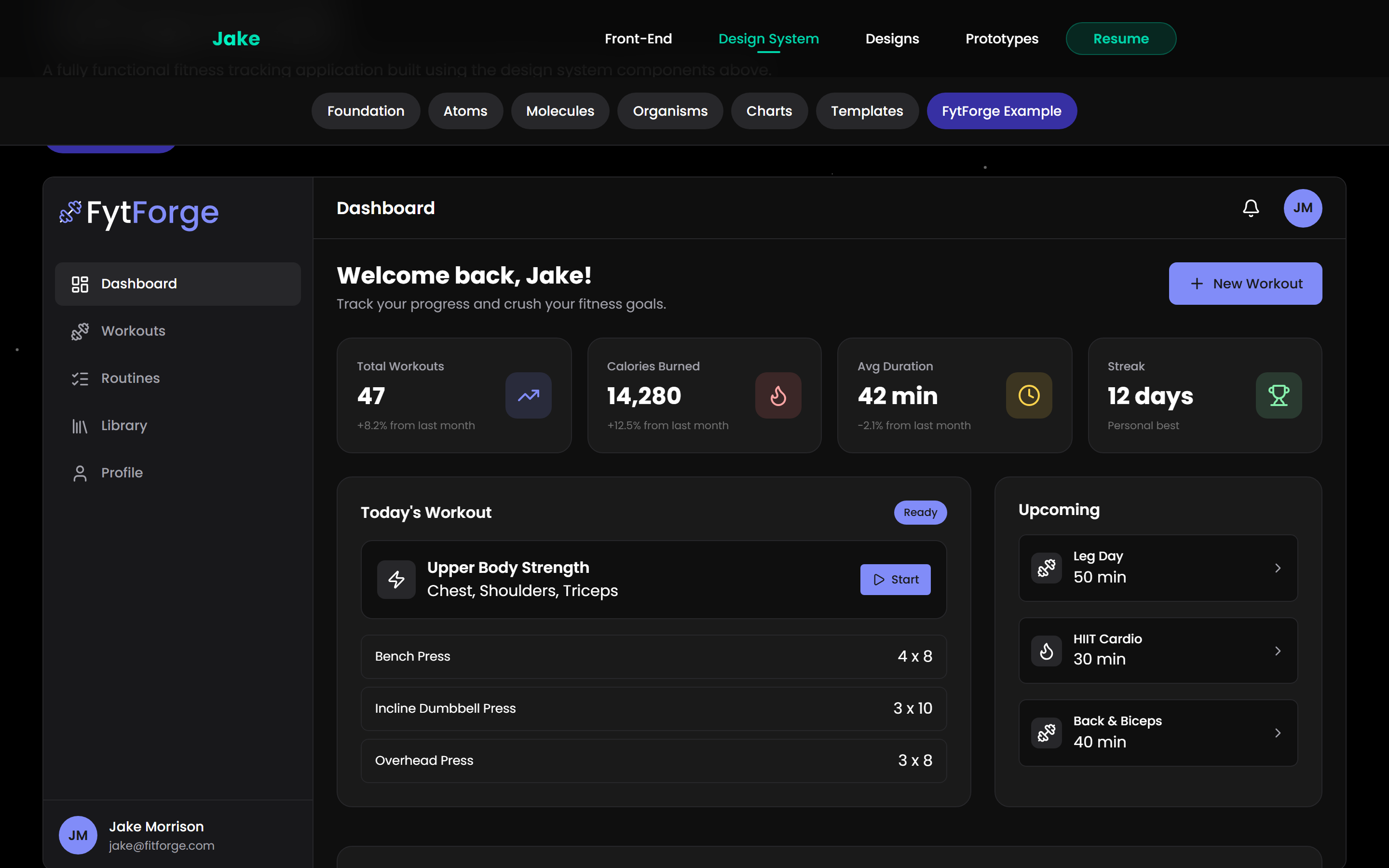
FytForge Example section — the system reassembled into real product screens so every component can be traced back to a pattern that's already shipped, reviewed, and tokenized.
How the system drives the product
- Single source of truth. Every token exported by the design system is the same token consumed by the Next.js app — no drift, no "dev approximated the spec" gaps. Changing the primary brand color in one place updates every button, badge, focus ring, and active pill across the product.
- Atomic hierarchy. Foundation → Atoms → Molecules → Organisms → Templates is the same structure FytForge's component library follows — small reusable pieces compose into full page views. Building a new feature starts by checking what the system already offers.
- Designed for dark. Chose a dark-first palette because 94% of gym sessions I've observed happen in dim or mixed lighting, and a bright app in that context feels hostile. Contrast ratios across the system meet WCAG AA for body text and AAA for headlines.
- Chart + template coverage. The system doesn't stop at buttons — it includes data-viz primitives and full-page templates so the FytForge Dashboard's workout-history chart and the marketing landing page both pull from the same visual vocabulary.
Website and app design
Two signature moments carry the landing page: the rotating four-video carousel that showcases the actual product in motion, and a scripted phone mockup in the About section that walks through the real app flow — home screen, browser, active workout, and library scroll. The phone animation resets every time it re-enters the viewport so visitors always catch the intro sequence, never the long final step mid-cycle.
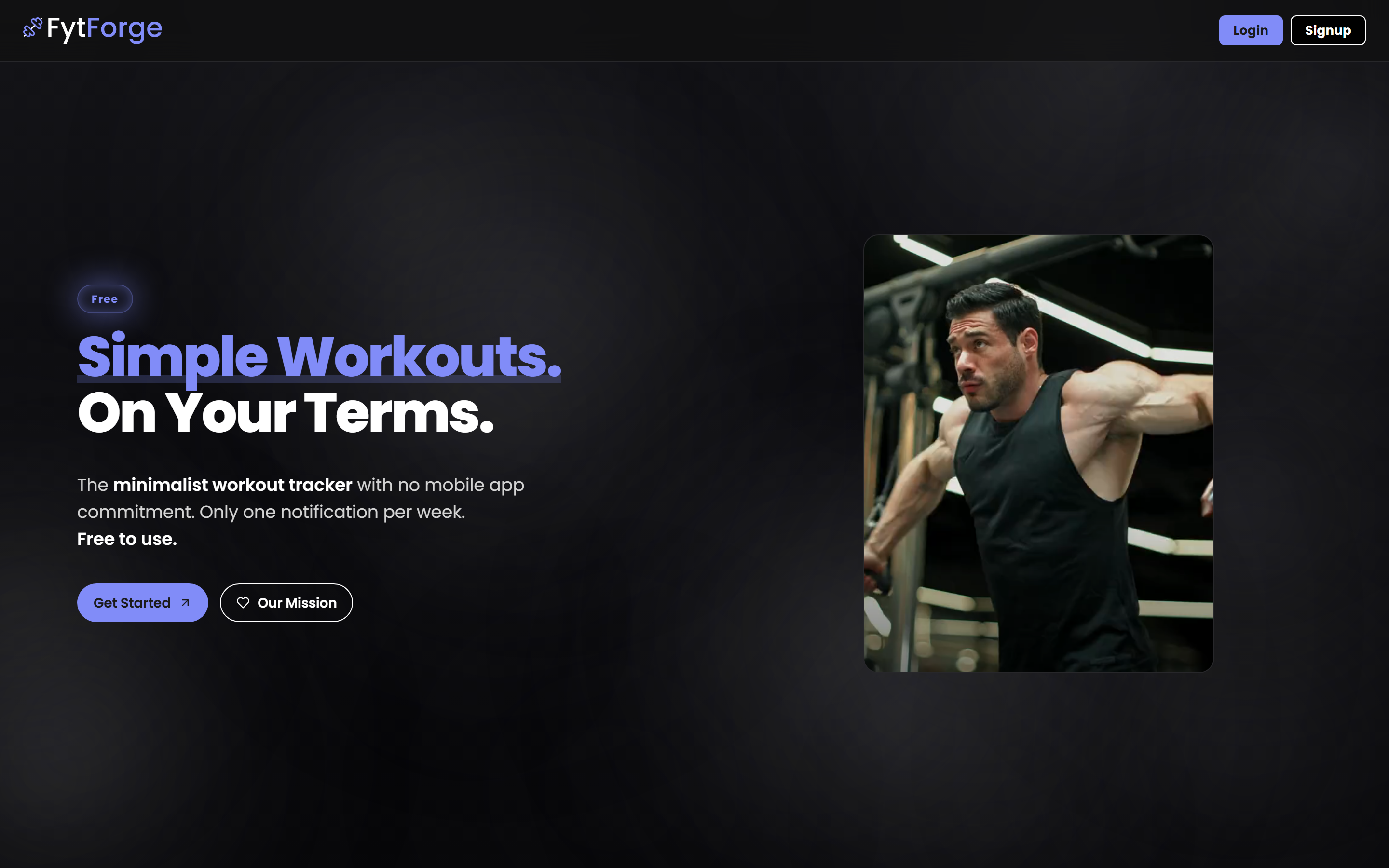
Desktop landing page captured live from fytforge.com — the rotating video carousel sits to the right of the headline, anchored by the lockup and a single primary CTA.
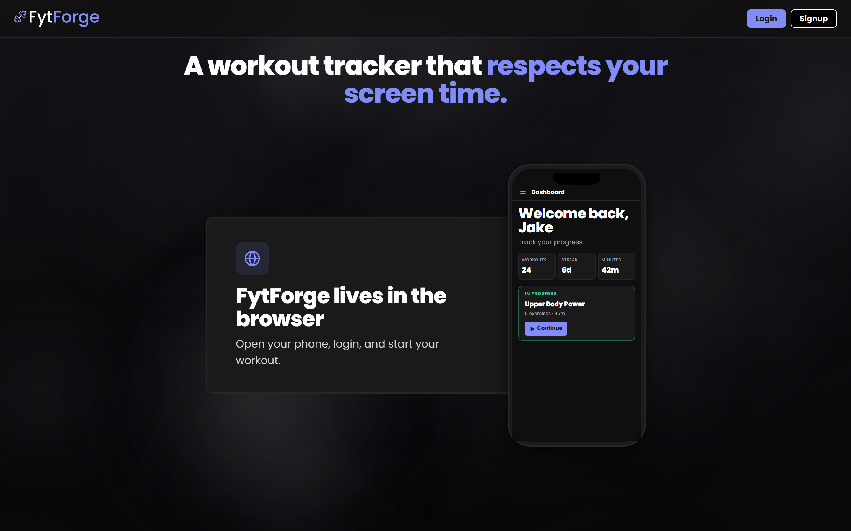
About section, live from fytforge.com — the animated phone mockup cycles through four real app screens, each transition tuned in milliseconds to match the pace of how someone would actually open, browse, and use the app.
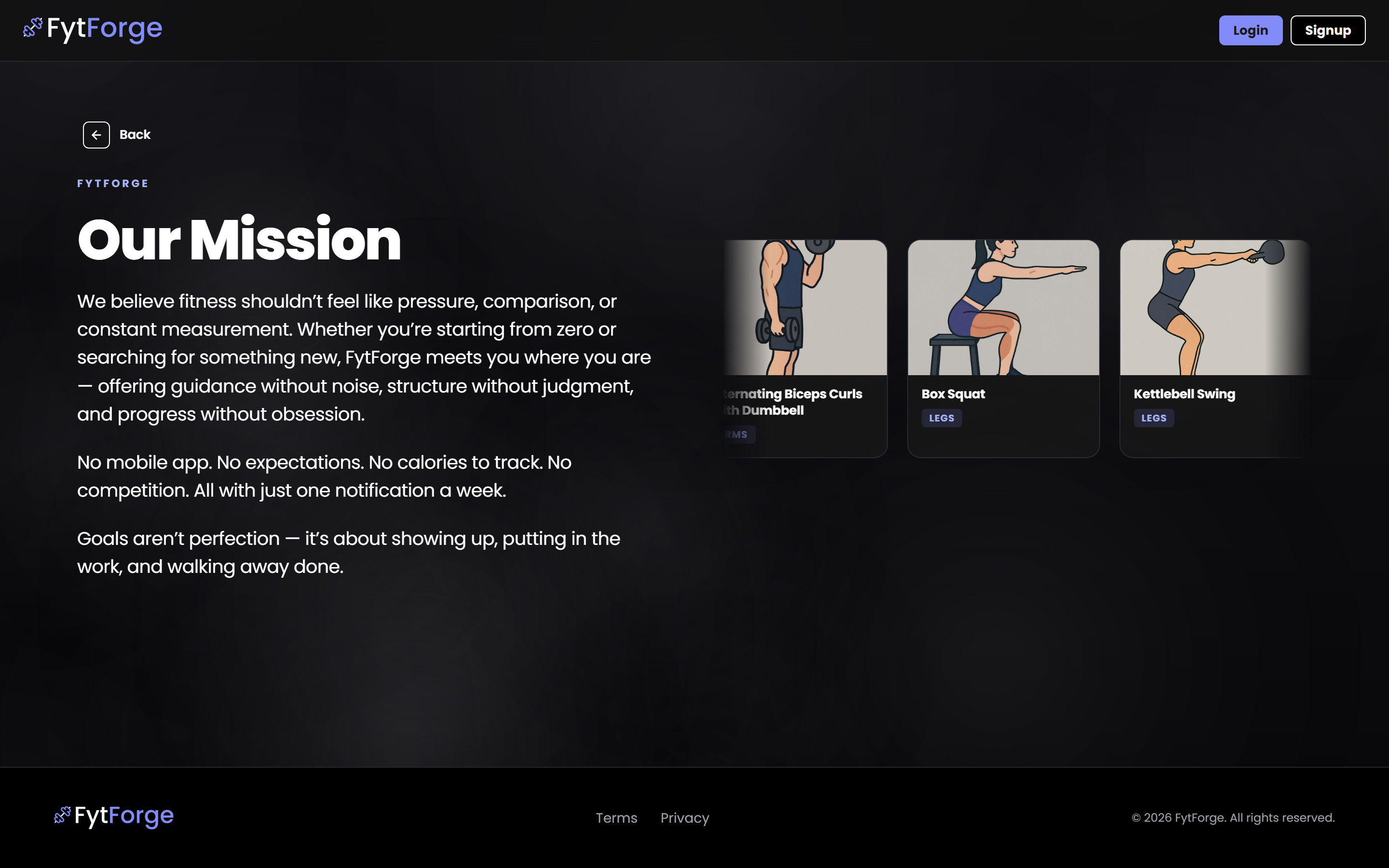
Our Mission page live from fytforge.com — the brand's manifesto against the notification economy, paired with an auto-scrolling carousel of real exercises from the library. Typography intentionally matches the hero for visual continuity between landing and brand pages.
Mobile View Preview


Technical Architecture
Built on Next.js in React and hosted on Netlify. Authentication and data live in Supabase with row-level security; every user-owned table follows an offline-first pattern — the browser loads instantly from local storage, then quietly syncs with the server in the background. The weekly email ships via a Netlify scheduled function that sends through Gmail every Sunday at 8 PM in the user's timezone.
TBD
As this product was just launched, the internal side of the startup brand will continue to advertise and grow the product to attain retention from customers to grow future metrics for impact. Stay tuned.