Shield Mastercard and Card Letter Design/Deployment
Learning Master design standards and the production process of a card payment letter was a first for me during this project. Not only did I make several mistakes, my team put full faith in my journey based on the skills I already had. It gave me more confidence, patience, and more importantly the result earned me experience in a very unique industry. Designing and deploying the software for me, is always the easy part.
Product Designer
& Front-End Developer
Senior Mobile App Developer
COO | Head of Product
CEO
Problem
The original API's and application structure only gave the user the ability to create and use a virtual card. But also, the user had to send an application for a physical card or call on the phone. This strained our software system and created uncessary pathways for our user that could be automated themselves with the ability to pick which type of card they wanted.
Business Challenges
- Determine physical card production costs long term
- Print on demand requires flexibility
- Limited marketing budget
- Exploring the options for the customer to order a card during sign up or afterwards
- Mitigating fraud risk from physical card usage and "Card Not Present"
Solution
- Designed a streamlined and intuitive card creation flow with consistent UI patterns and workable prototype covering all user journeys
- Implement brand strategy into the card letter design
- Deliver a unique yet simplified Shield Branded Mastercard
- Integrated IVR system for support and alternative activation
Competitors
At the start of this project it was my first time learning Mastercard Design standards and the production process of card letter printing. I made many mistakes, which resulted in learning more in the end. The only strength I had was having the confidence of good design and staying true to the Shield brand.
"The best way to see what was going on was to jump head first into fintech banking apps and how they presented their cards for ordering and print. So I downloaded their apps and ordered their cards."
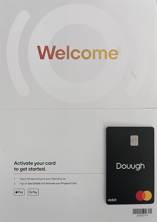
Clean welcome letter with card activation instructions and Apple/Google Pay integration
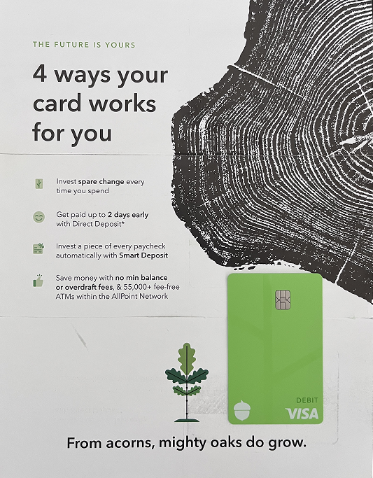
Feature-focused card letter highlighting investment and early deposit benefits
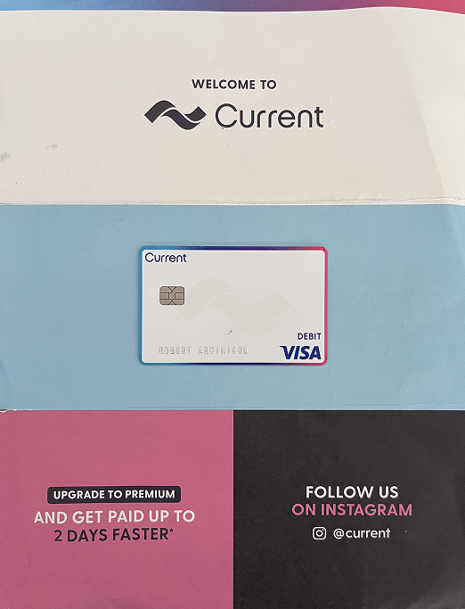
Simple welcome design with premium upgrade call-to-action
What I Learned
- Design the letter to be spacious and welcoming
- Make the card activation process easy to use and in app
- Reference mobile app features
- Design the card to adhere to low production costs
- Vertical cards are the modern trend
- Reference Google, Apple, and Samsung wallets
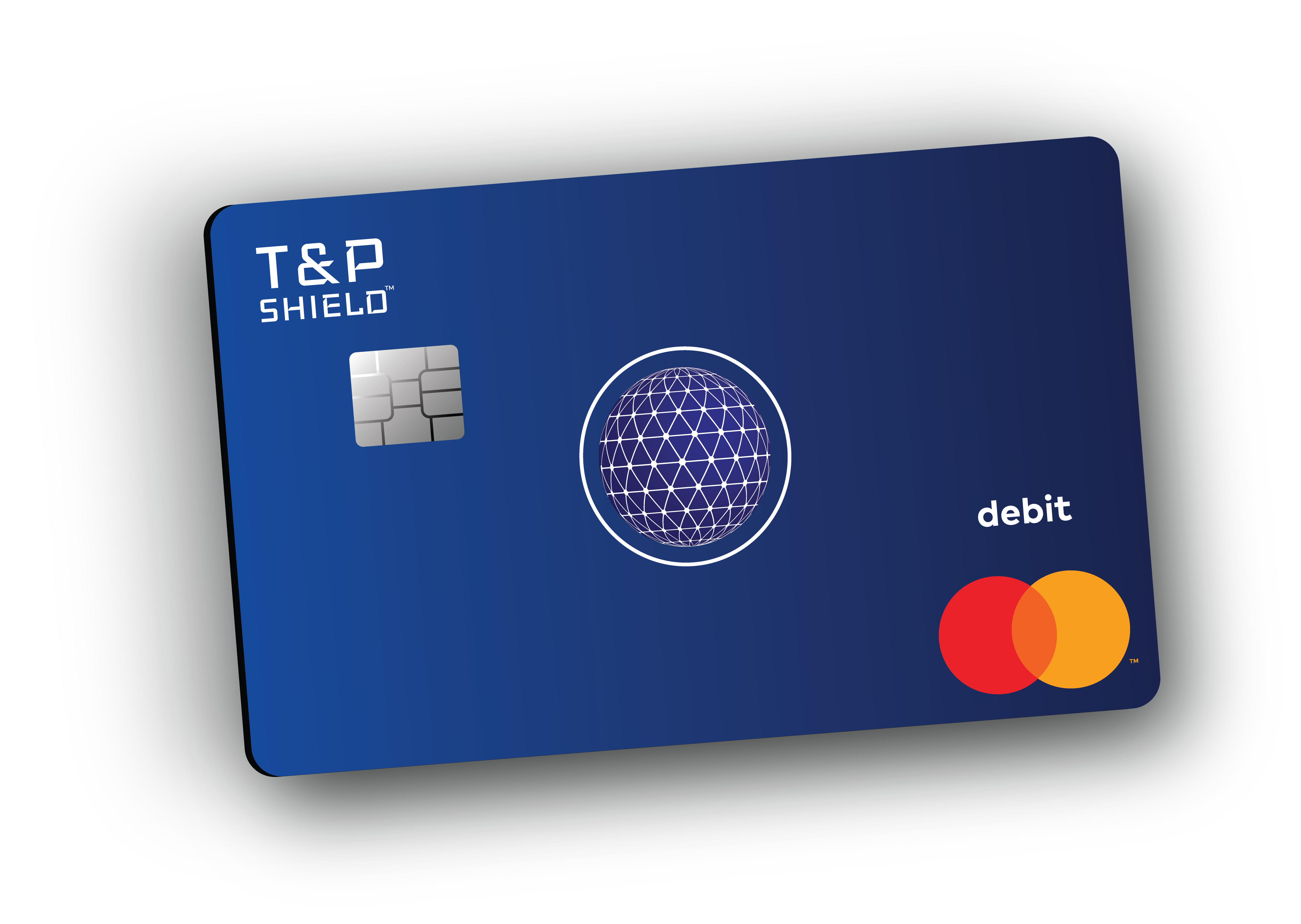
Logo and Vision
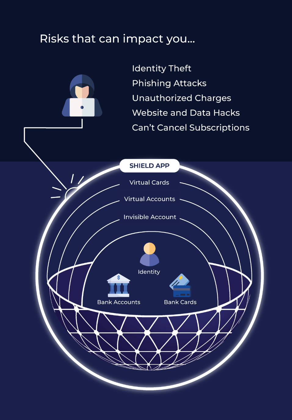
The focus of Shield was to create new accounts that protects your main banking checking and debit cards. With Shield, your money is represented within layers. Therefore, it will protect you from several methods of theft. The digital globe resonates that and the ring around it demonstrates protection. The font represents a digital style modern technology styled text.

The product of Shield was designed to sell itself based on layers of protection. The more account types you created, the safer your money and home accounts would be. The physical card was a testament of that.
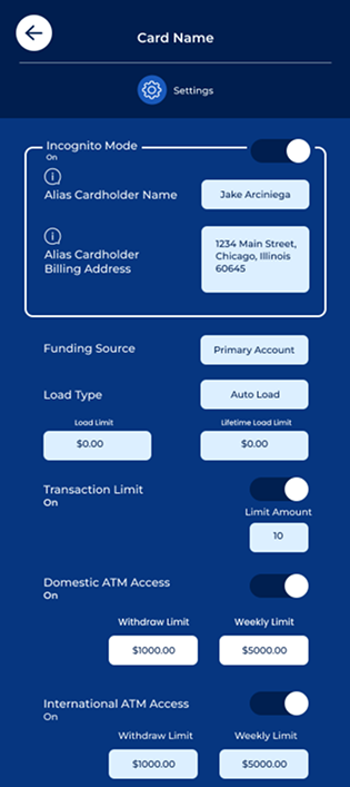
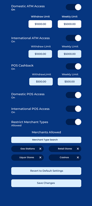
Unique Features
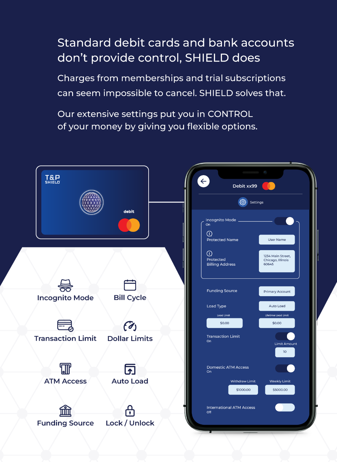
ATM access, spending limits, card locking, incognito mode, auto/manual load, POS access, and cashback control
Card is initially setup for the specific use case with a settings first option
Card PIN is defined during the initial setup process
Same features available with Apple, Google, and Samsung Pay wallets
Userflow
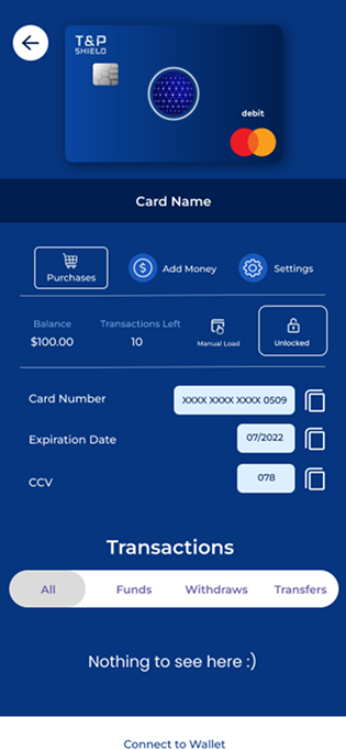
Card Design
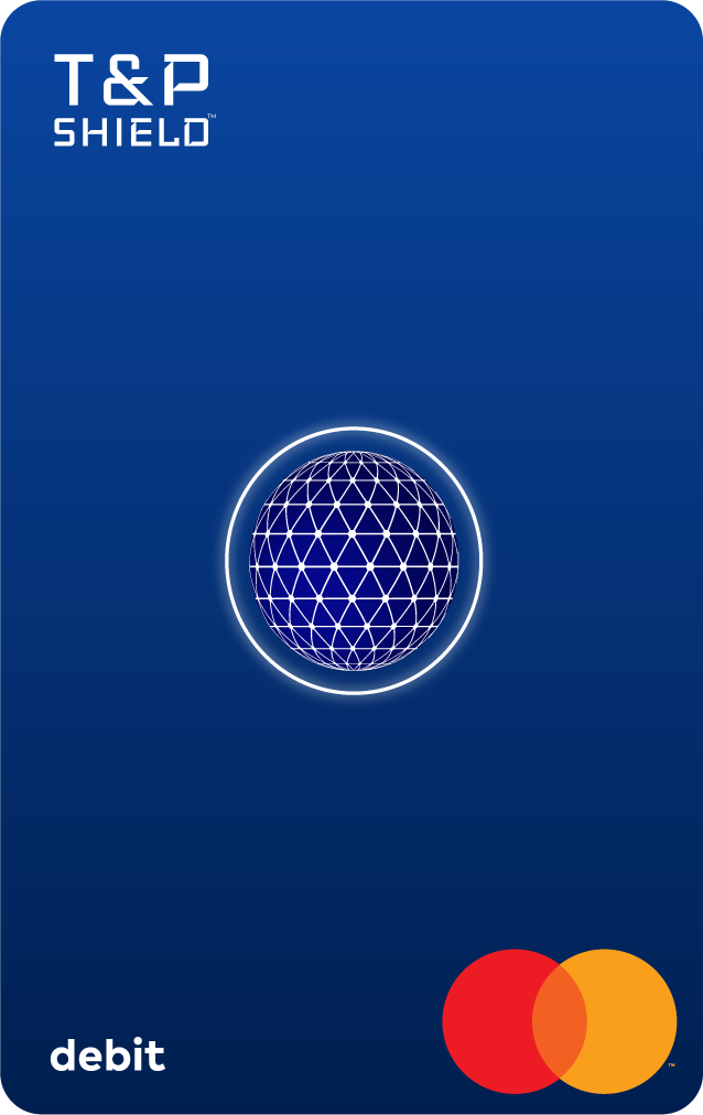
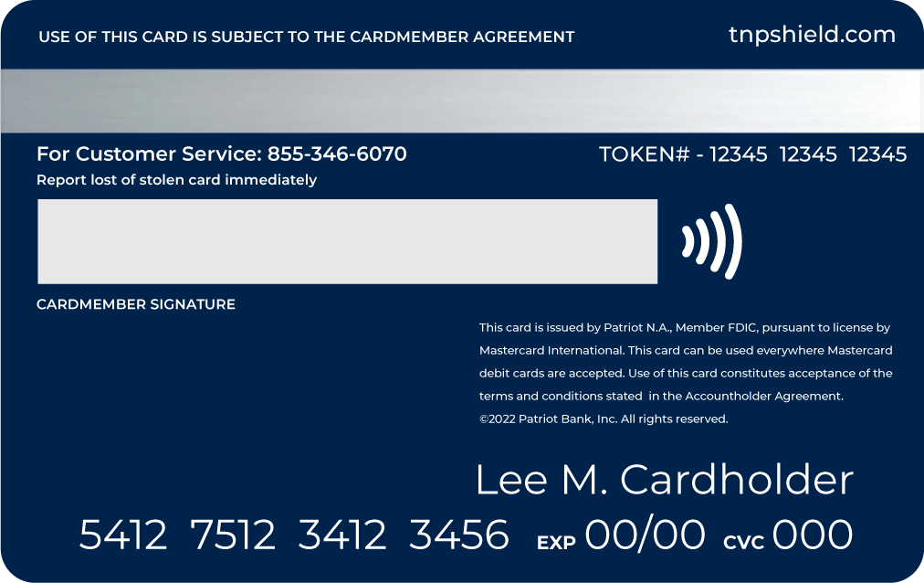
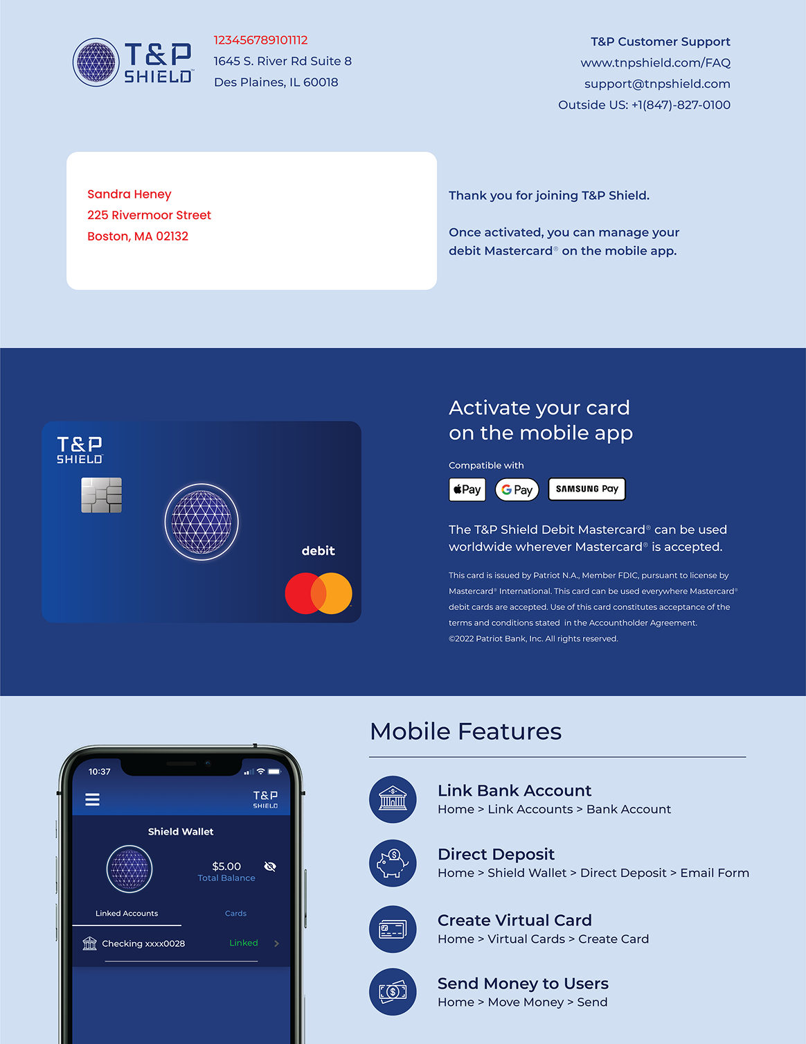
Staying true to the Shield brand I was able to integrate the company's 3D sphere icon into the card. This icon represents the concept of security worldwide. The Shield Debit Card (Mastercard) can be used worldwide wherever Mastercard is accepted. The Debit Card is issued by Patriot N.A., Member FDIC.
Card Letter Design
The card letter design was created to welcome new Shield Mastercard holders with clear activation instructions and key brand messaging. The layout provides essential account information in a clean, professional format.
Mobile App Flow
The mobile app guides users through ordering a physical card and activating it once received. The flow was designed to be intuitive and require minimal steps.
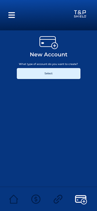 New Account
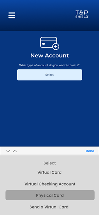 Select Type
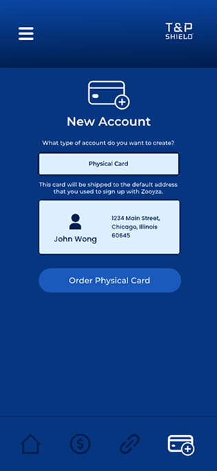 Order Card
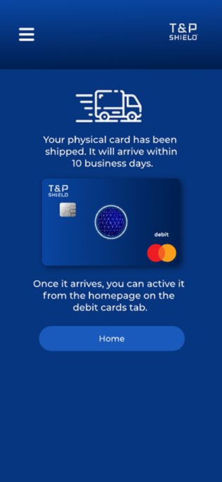 Card Shipped
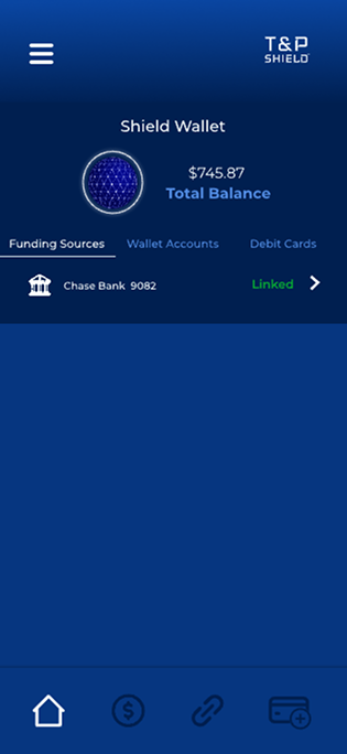 Wallet
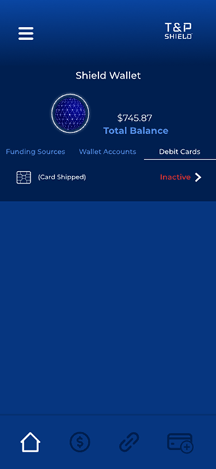 Debit Cards
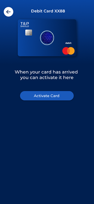 Activate
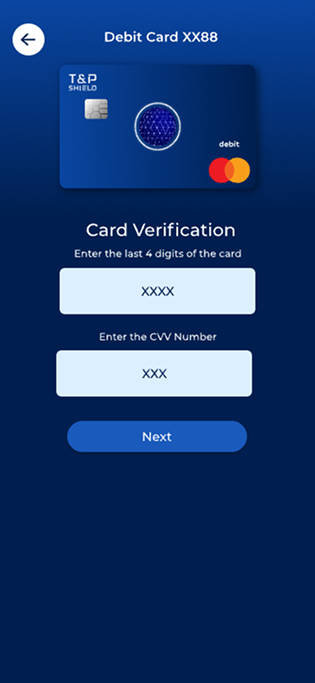 Verify Card
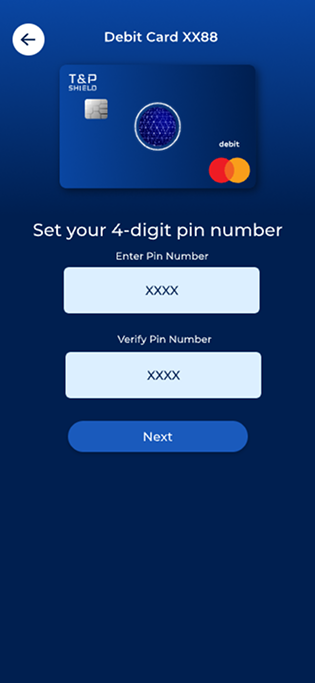 Set PIN
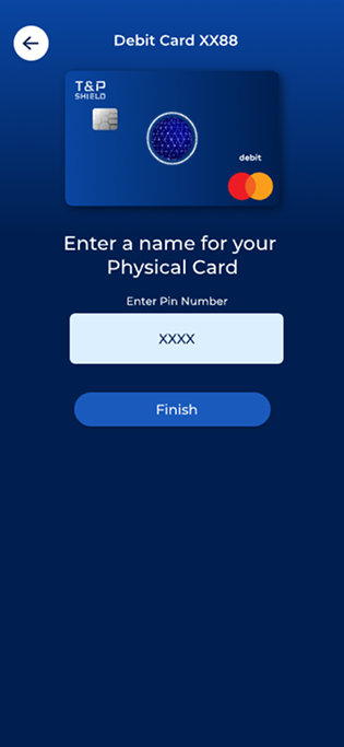 Enter card name
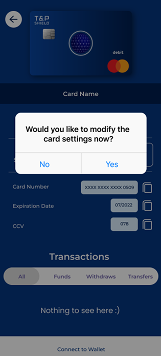 Modify settings
 Settings 1
 Settings 2
 Card screen
Reflection
The work laid the foundation for Shield's success, delivering key user experience improvements:
Multi-layered authentication with biometrics and PIN verification for maximum card protection.
Intuitive interface for activating, freezing, and managing debit cards with real-time controls.
Real-time alerts for transactions and security events keep users informed and in control.
Visual analytics help users understand and manage their spending patterns effectively.
By improving user experience and aligning with Mastercard's security standards, this work set the stage for future updates, driving both user trust and business growth.
We boosted adoption by simplifying the onboarding flow and card activation process. User engagement improved as the intuitive interface reduced support tickets, and we saw increased daily active users as customers relied on Shield for their financial management.