
Tulip
Grasping this product and the way it functioned from a software perspective was the biggest challenege for me in the beginning. We also had a lot of trouble finding a way to explain the product to potential clients and our customers. We needed to rethink the brand back to its ideation phase. As this product was very software heavy, the goal was to create a simple and easy to understand product.
Product Designer
& Front-End Developer
Senior Software Developer
Vice President
Problem
Spam email just shrouds inboxes. People have no way of stopping it or knowing what site is safe to sign up at. No tool exists and there is no way to track whitelists for email recipients.
Solution
- Automate website seeding with software that adds appropriate websites to initiate sign up tracking
- Create a 4-point 8-factor scoring system that can be easily resonated to the user
- Design and develop click automation software for website signups
- Design and develop a simple product website that auto detects each browser marketplace for install
- Develop product demo animations for clients and users
Data & Analysis
Who? & How?
The product foundation before Tulip had enough data acquisition to give us a great start. We had demographics to plan an idea of the best "user groups" to target our idea to. Finding a way to get users to engage with the product in a useful way was critical to our success.
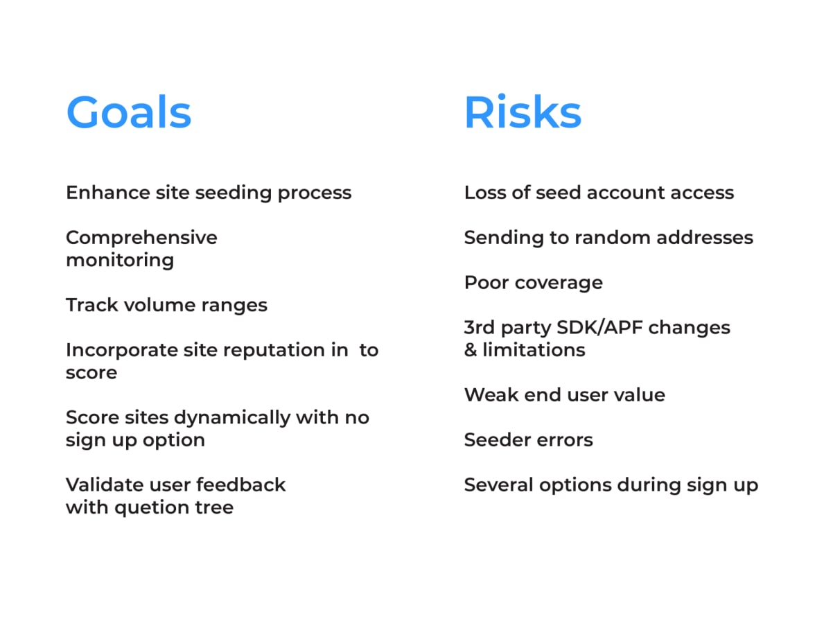
Goals & Risks Analysis
Comprehensive breakdown of UX objectives and potential challenges
Seeding Websites for User Data
Our senior software engineer was able to create a seeder module that was built into the Firefox browser. This randomly seeded sites on the internet that had low to no signups or was not in our database. From there, that list would dynamically generate sign up links to be filled out manually. As this became a time sink I used my front-end skills to create click automation software (using Node.js) to sign up for sites efficiently via form fields. Over time our data value and score efficiency increased.
User Testing & Feedback
Grasping this product and the way it functioned from a software perspective was the biggest challenege for me in the beginning. We also had a lot of trouble finding a way to explain the product
Initially we wanted to cover a way to score every possible site. Even if it didn't support the data we were trying to track. We developed a feedback loop in a more technical way to open up how we can deliver and even come up with new ideas.
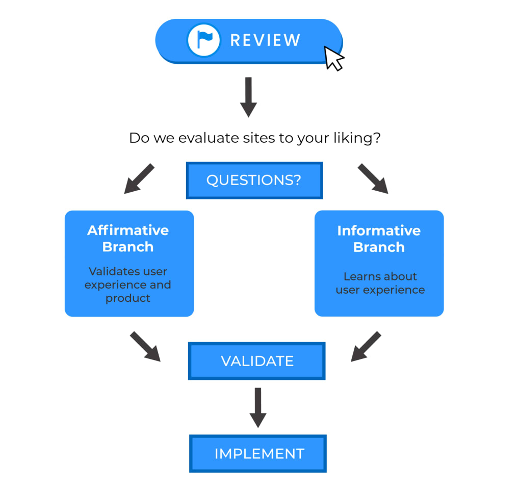
Validation Framework
Testing methodology and user feedback integration
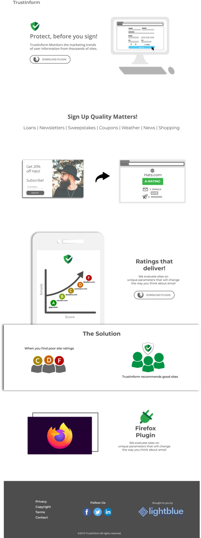
Rebrand & Discovery
We decided to take our branding a different route from our original name "Trustinform". To accomplish this we needed a different form of ideation. A few other members collaborated on the name but also to tell a story.
"They compared bamboo to a user's personal information on the internet. Much like bamboo, it starts growing right where you plant it. A few years later, you have an extremely invasive crop that you are unable to control."
By "Planting" the Tulip extension instead, the user is aware of the vulnerabilities and message count they could potentially receive. Proceeding with caution.
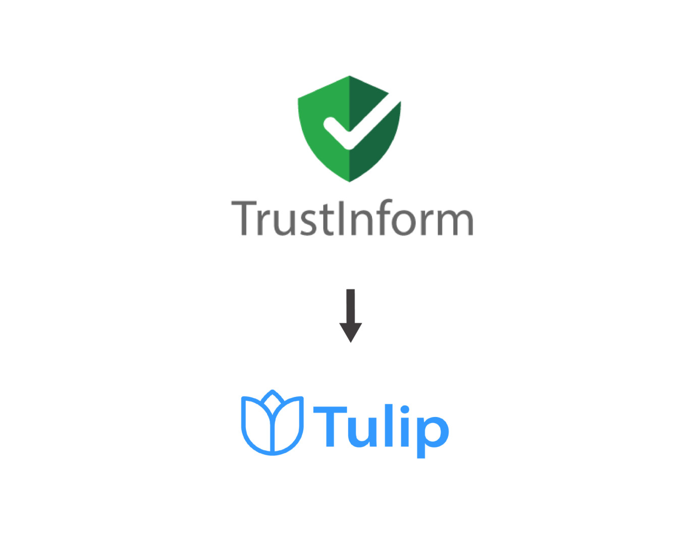
From Trustinform to Tulip - A complete rebrand with new visual identity
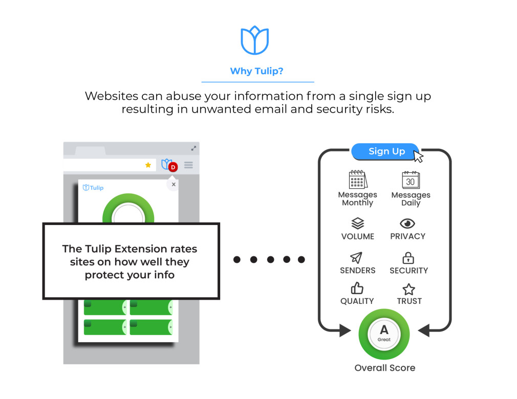
Visual breakdown of the extension's core functionality
Browser Extension
You can't just enter the extension market without a great idea and plan. Even then, to become a top-ten contender takes some simplicity and great design. Honey has the number one extension on the market for every browser platform.
Looking at their model was critical to adopt our own planning and ideas. During this thinking process we made the executive decision to take our search function out of our website and focus only on the extension.
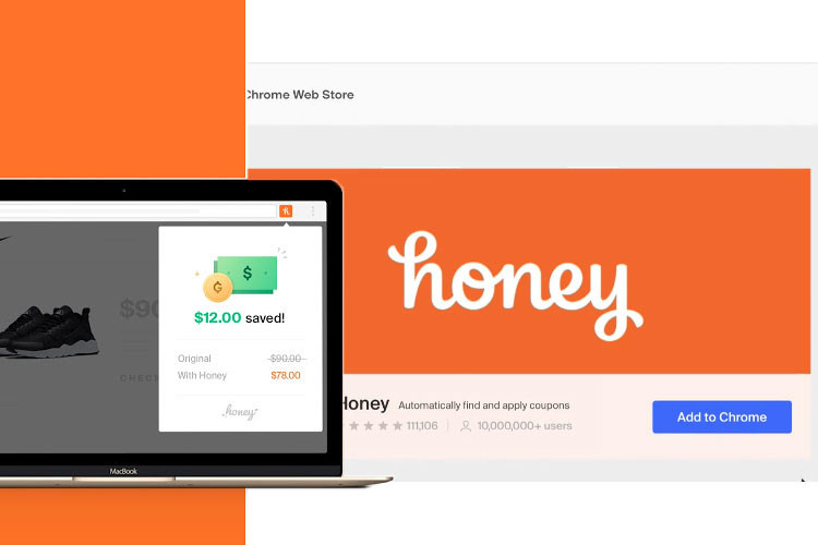
Analyzing Honey's successful extension model
Icon system and interface elements for the extension
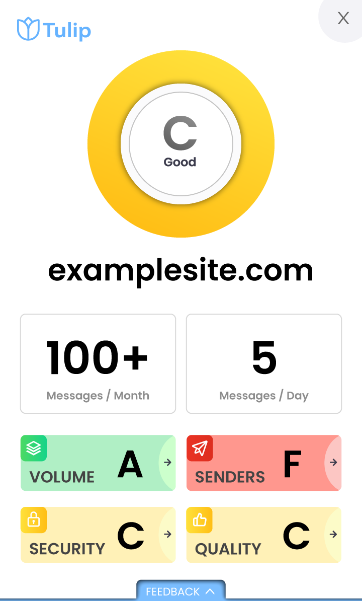
Complete extension UI showing security scoring
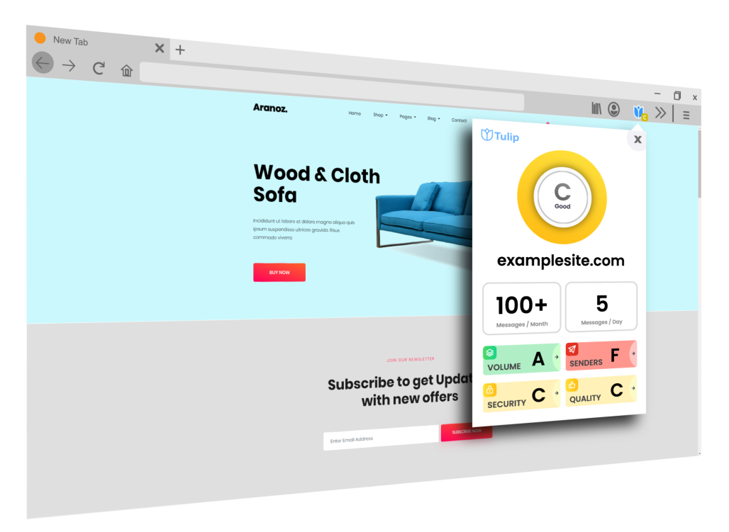
How Tulip appears in the browser environment
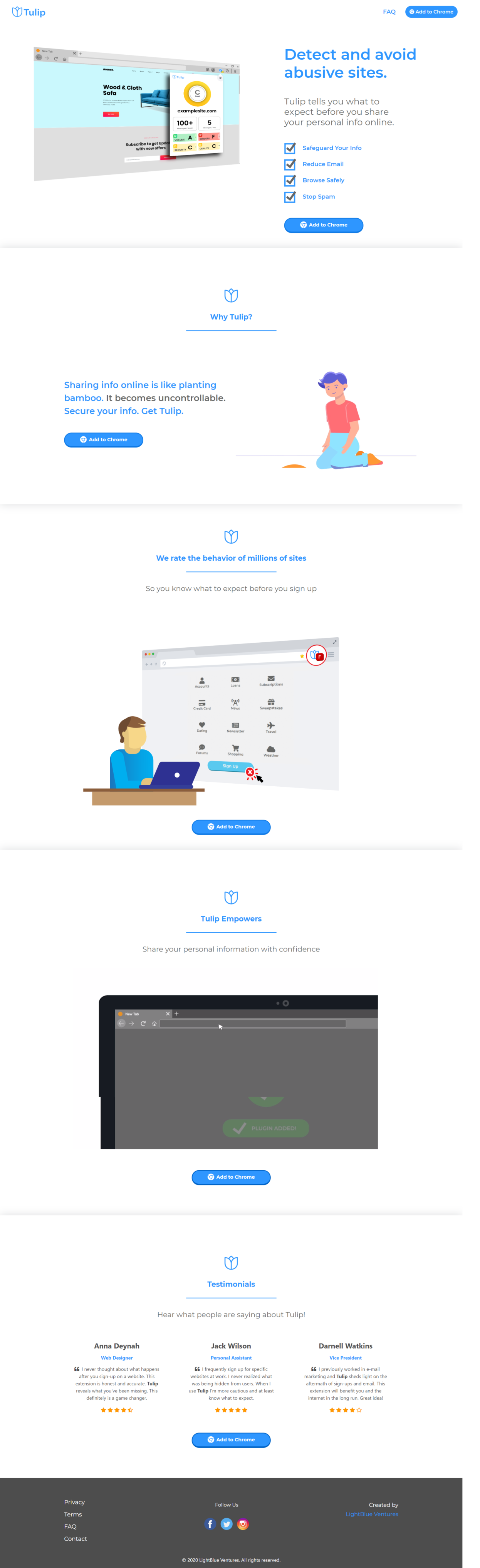
Website Design
While working on designing the site with the brand change we really wanted to keep it simple. Explain the product, how it works, and why anyone can benefit from using it. I collaborated with my team, mocked up several variations of design, and developed the front-end look and feel that we were looking for.
Initial Concept
Early wireframe and mockup exploration
Final Design
Launched website at addtulip.com
Extension Store Launch
We successfully landed our mark on the Microsoft, Firefox, and Chrome extension stores.
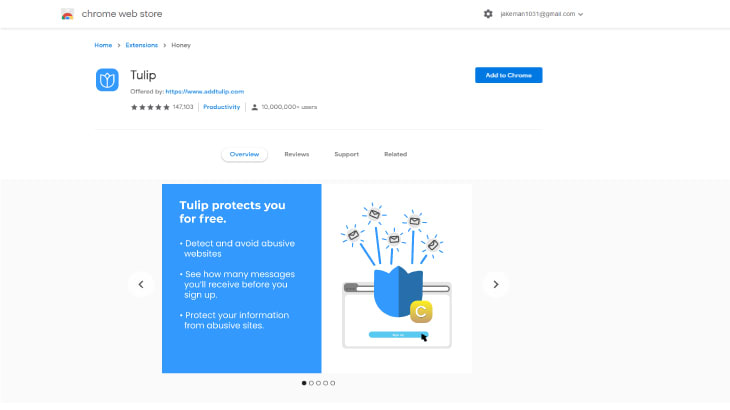
Store Asset 1
Extension overview and features

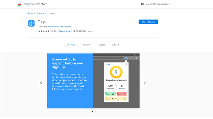
Store Asset 2
Security scoring demonstration
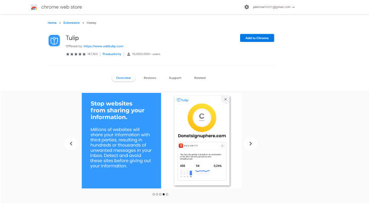
Store Asset 3
Email tracking insights
Store Asset 4
User benefits and value proposition
Reflection
The work laid the foundation for the extension's success, delivering key user experience improvements:
Users can now see security scores before signing up, making informed decisions about sharing their data.
Clear visualization of potential email frequency helps users understand marketing practices.
Simple, game-inspired design makes security information accessible to all users.
Successfully launched on Chrome, Firefox, and Microsoft Edge extension stores.
By improving user experience and aligning with our vision for email transparency, this work established Tulip as a trusted tool for privacy-conscious users.
We boosted installs by promoting across multiple browser stores and encouraging users to take control of their email privacy. User engagement improved as the intuitive interface reduced friction, and we saw increased session duration as users explored security insights.
Key Learnings
Building Tulip taught me the importance of simplicity in product design. The browser extension market is incredibly competitive, and standing out requires not just great functionality but also intuitive design that users can understand immediately.
The rebrand from Trustinform to Tulip was a pivotal moment that showed me how powerful storytelling can be in product positioning. The bamboo analogy resonated with users and made the value proposition instantly clear.